Read below for 20+ Email Testing Ideas! With the tools available to marketers today, sending an email campaign is easy. Ensuring that your next email campaign is more successful than the previous one, however, is something that many marketers struggle with.
Sometimes this is simply because marketers have run out of ideas for things to test (you can only A/B test your subject lines so many times!). The good news is that by reading this article that issue is easily overcome.
Ready to get testing? Here’s a list of email testing ideas for you to try in your future email campaigns:
1: When you send your email
Chances are that you’re either sending your email out the same regular time or are sending it out whenever you’ve got it ready. If either of these apply to you then it’s probably worth testing out what day of the week and time of day generates the best engagement.
Pick the day and time you think generates the best opens and clicks and send an email only at this time for a few weeks. Then move onto a different time and see if that yields any different results.
Read: What Day Should You Be Sending Your Email in 2018?
2: Call to actions
Call to actions (CTAs) are directions you give people reading your email to move them through your sales funnel. Basic CTAs in email marketing include “read more here” and “visit our site” with links through to your website. Better ones would include well designed buttons that stand out and are visually appealing. The text on these buttons should also be more unique than generic statements.
Try improving the CTAs you include in your emails so that they are aesthetically pleasing and test different wordings as well. For example, ecommerce businesses could try including ‘buy now before they’re all gone’ buttons in their promotional emails.
3: Emojis

Most email clients now support emojis in emails. Adding one or two emojis to your email subject line can help your email stand out in people’s crowded inboxes. Just don’t go overboard with them and maintain your brand image when using them. If your brand doesn’t lend itself to using emojis, then it’s probably best to try the other items on this list.
If you do decide to test the effectiveness of emojis, then take a read through our guide for using emojis in emails which outlines some of the considerations you should take into account.
4: Adding a sense of urgency

Adding a sense of urgency to your emails can help capture people’s attention and get them to take up your offer before it’s too late. This is particularly relevant for ecommerce stores trying to sale their products through email.
Like with emojis, going overboard here can make your emails appear spammy. It’s probably best to avoid subject lines like “LIMITED 100% FREE OFFER – CAN’T LAST” as they can dissuade your recipients from opening your email. It could even land your emails in the spam folder.
Read: How NOT to Write Your Email Subject Line for E-Commerce
5: Personalize your emails
If you’re not already personalizing your emails by using the subscriber’s first name instead of a generic ‘Dear Customer’, then it’s time to test using dynamic content. You can go beyond simply including someone’s name too. You can keep your email content to that you already know the recipient will be interested in.
Personalized emails have been shown to be generally more effective than unpersonalized ones. So if you’re already personalizing what you send to your email list, then it’s not as worthwhile testing generic emails.
6: Subject lines
Obviously your subject line should be based on what the email itself is about, but that doesn’t mean you can’t test different approaches. Would a light, playful tone perform better than a professional or serious one? Does personalizing your subject line with your subscriber’s name lead to a better open rate?
Subject lines are something you should always be putting effort into. It’s easy to keep using the same type of subject line on every email you send, but this will just leave your subscribers getting tired and ignoring your emails as a result. This is one thing you definitely want to be keeping fresh.

7: Length of email content
Do you tend to send short and sweet emails, or are your emails longer and packed full of content? Whichever one you are currently sending, it worth testing the opposite to see how your readers will react.
Shorter emails have the possibility of holding people’s attention better and giving subscribers the opportunity to read through everything before something else distracts them and they lose interest in your email. On the other hand, your email list might be filled with people who would appreciate longer form content from you.
8: Images

Unless you’re sending plain text emails, you’re probably already including images. If not, including images is something definitely worth testing.
Experiment around with the number and type of images you’re including. GIFs are attention grabbing and something you can easily test compared to the usual jpeg or png image.
9: Video

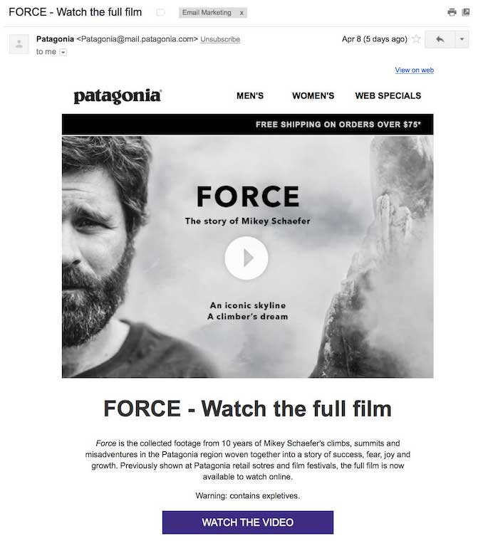
Video in emails has been shown to more than double click through rates. To see if your subscribers respond to embedded videos in your emails in the same way, try including a video in a few emails and see what the results are.
10: Closing line
How do you sign off at the end of your emails? Do you simply say ‘kind regards’ or ‘thank you’? You could try adding a more unique farewell at the end of your email that suits your business better. For example, an antiques dealer could sign off with ‘happy collecting’.
If you currently have a sign off, you can also experiment with not including one at all. Instead simply end your email with the last piece of content and how your subscribers react.
11: Layouts
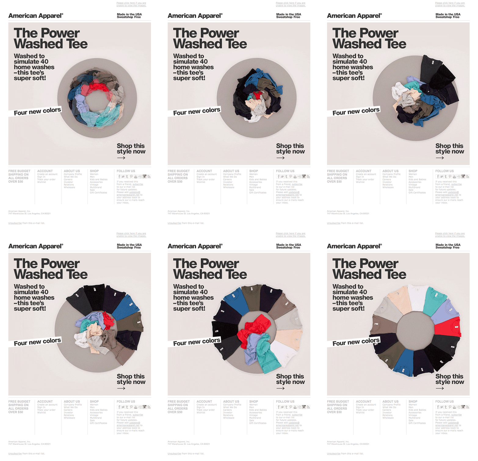
You can easily test different email layouts such as the number of columns, whether you use edge-to-edge images, and whether you include buttons next to an image or beneath them.
There’s a huge variety of email layout options for you to choose from, so instead of testing them all at once, remember to just test one thing at a time and wait until you have the data to determine whether the change had a positive or negative impact before moving onto the next element to test.
12: Plain text vs HTML email
Plain text emails might appear more boring compared to their HTML cousin, but there are a few reasons they can sometimes perform better. Firstly some plain text emails fair better at getting through spam filters than HTML emails. Sometimes inbox clients will block images from appearing in HTML emails even if they make it to the inbox. This means that email marketers have more control over how a plain text email will appear, mainly because less things can go wrong.
There will be times when plain text emails aren’t appropriate, such as for fashion related businesses advertising clothes. If however you think that your subscribers might react positively to plain text, then it’s worth testing.
13: Color scheme

Unless you’re sending plain text emails, then you can experiment around with the colors you add to your emails.
In general, it’s best to keep the colors so that they’re consistent with your brand. Within this there might still be room to play around with slightly different colors for different design elements.
14: Frequency
How often you send emails to your list can have a big impact on your open rates, but do you know your optimal send frequency?
Nobody wants to receive an email from a business every single day. So if you’re currently blasting emails out every day or two, try pulling back to only one a week. Conversely, sending only one email a month, or even less frequently, might not be enough to keep your list engaged. In this case try a fortnightly or weekly email and see if that improves engagement.
15: Including your CTA in the subject line

Including a CTA in the body of your email is pretty much essential if you want your emails to perform well. But you can also include your CTA in the email’s subject line. This way people see it even if they don’t open your email.
This can be as simple as changing your subject line from something along the lines of “A Special Offer Just For You…” to “Claim Your 20% Voucher on Our Site Now”.
If done well this could lead to more opens and conversions, the only way to find out is to test it on a few emails.
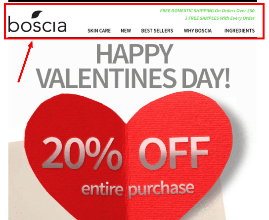
16: Having a navigation bar

If you don’t have one already, experiment with having a navigation bar in the header of your email. These bars should contain links to the most popular categories on your site.
This might help you get more people reading your email clicking through to your site, however it can also take away from clicks on the content of your email. The only way to know for sure whether a navigation bar in your email header is good or bad for your email marketing is to test it and look at the data.
17: Changing the writing perspective

Do you write your emails in first person or third person? Do you address your subscribers in second person with pronouns such as you, your, ect.
Changing this perspective in your email copy from something along the lines of “apply the discount code during checkout” to “apply your discount code when you checkout” can seem more personal to your recipients. Experiment around with this to see which perspective works best.
18: Social media links

Including links to your social media profiles in your emails can be a great way to boost your social media followings.
To avoid distracting from the content of your email, place the links in your footer.
19: Active vs. passive voice
The difference between active and passive voice is whether you emphasize your sentence construction on the doer of the action or the receiver of the action. For example, “the child ate an apple” is active voice, while “an apple was eaten by the child” is passive voice.
Most people will advise that the active voice is nearly always preferable to the passive voice. Despite this, if you feel that your audience might react better to the style you don’t typically use, then it’s worth testing your hypothesis.
20: Having a single focus
Emails will either have a single point to get across to the recipient or multiple points.
If you tend to send emails that are filled with many different points you want to convey, then try limiting yourself to a single point to make. This can help keep your subscribers focused and from getting distracted. If you’re already doing this, but are sending multiple emails very week to get all the information across, try condensing this down into fewer emails. Receiving fewer emails can lead to better open rates and engagement on the emails you do send.
There you have it, 20 different things you can easily A/B test.
Not all of these ideas will be relevant to your business. Even if they were, it would take a very long time to properly test all of the ideas on this list.
It’s important to only test one factor at a time. There are ways around this with multivariate testing, but for most marketers an email campaign won’t generate enough results for multivariate tests to have statistical significance.
At the end of the tests, you should be looking for improvements in open and click through rates. As your business scales and you get more results, you can then shift your tests results to focus on sales.
The point of this list is to give you some new testing ideas. Pick a few of the ones you like and think are worthwhile testing and test them thoroughly. That way you’ll gain much better insights than trying to test as many factors as you can.
Read summarized version with


