Did you know that 69.23% of online shopping carts are abandoned ?
Think about what that means for your business. Out of every 100 customers who put items in their cart, 69 of them never make it through the check out. That represents massive amounts of lost revenue!
Abandoned cart emails are an extremely effective way to pull those buyers back to your website and get them to complete their orders. Half of them are opened and a third of the clicks leads to a purchase.
In this article, I’ll share 7 great abandoned cart emails, and the lessons that you should learn from them!
1. Bonobos

What I like:
- “Forget something?” works well as a headline because people often get interrupted, abandon their carts, and then simply forget to go back.
- “Don’t worry – fit happens” takes the pressure off the customer and lets them know that the company understands that they have their reasons for abandoning the cart. The last thing you want to do is make your customers feel guilty!
- “As a new customer, you get 20% off your first order” is a great way to give the customer that extra nudge towards the purchase.
One thing I’d do differently here is change the call to action button color into something bright that would make it pop in the overall color scheme.
2. Sheridyn Fisher Swimwear

What I like:
- “We just want to remind you before it sells out” and “Get it before it’s gone!” creates a sense of urgency and scarcity. Customers are more likely to go back and complete their purchase if they realize that they don’t have all the time in the world.
- “Your shopping bag” section with images of the abandoned items reminds the customer what they wanted to buy and why. Remember, a picture is more powerful than a thousand words!
- “Free shipping within Australia for orders over $100” encourages customers to spend more money to get free shipping.

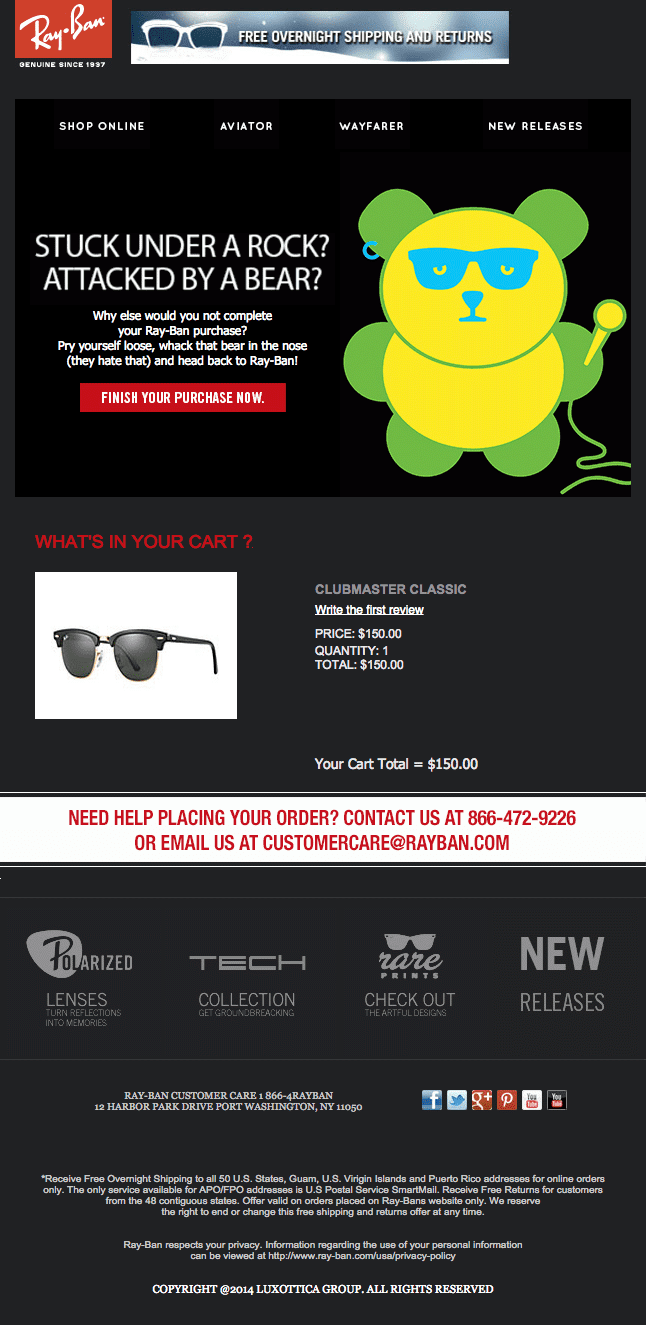
3. Ray-Ban

What I like:
- “Stuck under a rock? Attacked by a bear?” is a headline that immediately grabs attention. It, together with the text that follows, also reinforces the image of Ray-Ban as a casual, fun brand.
- “Finish your purchase now” is a great call to action button because it gives the customer a nudge to complete the purchase. Pay attention to how it is red and stands out in the overall color scheme.
- “Need help placing your order?” ensures that confused customers know where they can get help. People often abandon their carts simply because of technical glitches. You want to be there and give them a hand when that happens.
4. Columbia

What I like:
- “We’re here to help” works well as a headline, especially in situations where the customer abandoned the cart because they were confused, or because of a technical glitch. It also doesn’t feel salesy.
- “Check the site for product reviews, or give us a call or email” gives the customer clear instructions of what to do next, providing both a self-sufficient option and an option to get help.
- “View your cart” is a call to action button that works well with this low pressure email. It’s noncommittal enough for the customer to just click it without giving it much thought. Note that it’s important to adjust your call to action button to the overall tone of the email.
Get Started on your Abandoned cart Emails with SmartrMail today
? Install SmartrMail and Automate your Abandoned cart Emails ?
5. Victoria Secret

What I like:
- “You left a whole lotta sexy in your shopping bag” is a great headline because it immediately grabs your attention and reminds you why you were shopping on Victoria Secret’s website in the first place. They’re basically asking you whether you still want to feel sexy. And who doesn’t?
- “Get those sexy little goodies before your bag expires!” introduces the scarcity element to this email and adds urgency. Without it, the customer might say “Later”, close the email, and forget about it, but now they know that the clock is ticking. This makes them more likely to click through to their cart.
6. Virgin Trains

What I like:
- “You’ve dropped your ticket!” is a headline that has character, is fun, and grabs your attention. It immediately conjures the image of being in a busy train station. And that’s exactly where Virgin Trains want your mind to go.
- “Don’t lose that ticket to Birmingham” and the “From” and “To” locations shown on the ticket reminds you where you wanted to go and why. Once again, that’s exactly where Virgin Trains want your mind to go.
- “Don’t worry, we’ve got it safe – but we can’t guarantee that the price won’t go up” introduces the element of scarcity. If you wait, will you still be able to get the ticket for the same price? This uncertainity makes people more likely to complete their purchase.
Note that the main call to action button one, “Pick Up Your Ticket”, is the same color as the background, meaning that it doesn’t stand out and grab attention. Yellow would probably work better there.
Also, “More Reasons To Book” each have their own separate call to action, which doesn’t always lead back to the abandoned cart. They are unnecessary distractions! It’s always better to only have one call to action button!

7. Dollar Shave Club

What I like:
- “Stick around this time” might seem a bit pushy, but combined with lighthearted style of the email, it works for the Dollar Shave Club. Be careful with headlines like this, though. You don’t want your customers to feel like you are guilt tripping them!
- “Join the club” is a great call to action button because it feels social and fun (who doesn’t want to belong to a club?). Pay attention to how the button is orange and really pops in that color scheme. Also, note how there’s only one call to action in the entire email. There’s nothing to distract you from joining the club.
- “Don’t just trust Chuck” section is a great idea because it provides social proof. Pay attention to how they provide a name and a photo for each testimonial. Also, note how one guy is a soldier and the other guy is a firefighter – the kind of people that men want to emulate.
What are the key lessons here?
Okay, so here are the the main take-aways from analyzing these great abandoned cart emails:
- Make sure that your branding is consistent. Is your brand serious or lighthearted? That should be reflected in the tone of your abandoned cart emails. Don’t confuse the customers by having a serious brand and then sending wacky emails or vice versa. Consistency is very important.
- Have an attention-grabbing headline. When someone opens your email, the headline must immediately grab their attention, otherwise you risk them closing it and moving on. Try to strike the right balance between nudging the customer in the right direction and not being too salesy.
- Have a single call to action button. The sole purpose of an abandoned cart email is to get the customer to revisit their abandoned cart and complete the purchase. That should be your one and only call to action. Everything else is a distraction.
- Make sure that the call to action button really pops. Your call to action button must stand out in your overall color scheme, so pick a color that is not used elsewhere and that contrasts well with the bakcground color. Yellow, green, and red are often good choices for the call to action button.
- Add images of the items in the abandoned cart. You want to remind the customer what they were about to buy and why. The best way to do that is to show them the content of their abandoned cart.
- Introduce the element of scarcity. You don’t want people to open your email, then decide they’ll check their cart later, and then forget all about it. Adding some urgency really helps with this. Remind them that their cart might expire, the prices might change, etc.
- Have free shipping? Mention it! People are always worried about shipping costs so having free shipping removes a mental obstacle that might be standing between the customer and the purchase.
Apply these lessons and you’ll be way ahead of your competitors!
Conclusion
Abandoned cart emails are a great way to nudge people to return to your store and complete their purchases. In fact, not using them can lead to thousands upon thousands of dollars in lost sales. So what are you waiting for?
SmartrMail offers easy and reliable way to send great abandoned cart emails. So start doing it and watch the sales roll in!
Get Your Own Great Abandoned Cart Emails
SmartrMail lets you automate great abandoned cart emails in minutes. You can set up to 3 recovery emails and control the time between people abandon their carts and receive the emails.
You can also include product recommendations in the bottom of the emails, offer a discount, offer free shipping and more.
Seeing how essential abandoned cart email campaigns are and how easy they are to set up, there’s no reason to delay adding them to your ecommerce business any longer!
To learn how to set them up, check out our comprehensive guide that covers everything you need to know about abandoned cart emails and how to set them up in SmartrMail.


