Design. This simple, frequently used word packs such a punch when it comes to your ecommerce store’s email newsletters. Why? Because how you design your newsletter—everything from how it looks to how clearly it gets your brand’s message across—will have a drastic impact on the behaviors you want from those on your email list.
Opens, click-throughs, and traffic back to your site are all dependent on how your email looks to your audience. From the moment it’s sitting in their inboxes, before they even click it open, design is already an important factor because they have to decide if they want to spend their precious time out of their day on giving your email even a moment of their time.
Awesome email-newsletter design is the huge, persuasive factor in your recipients paying attention to your email and converting versus just ignoring it. Remember, just because someone subscribes to your newsletter doesn’t guarantee that they’ll actually read its content!
To increase the number of people who do open your email and click through to your store, implement these winning design tips.
It All Starts With the Subject Line
Too many ecommerce-store owners make the mistake of thinking that design only refers to the actual content and look of said email. Wrong! Design begins right from the nanosecond your newsletter lands in your recipient’s inbox. There, the subject line is the only weapon you have to convince them to open your email. The subject line is ground zero when it comes to designing for conversions—you better make it count.
Here’s how:
- Stick to 50 characters or less, as HubSpot reminds us that anything longer than that could get cut off on mobile devices’ displays
- Use your recipient’s name in the subject line for the ultimate personalization token
- Clearly reveal what’s inside the body of your email
- Use action-oriented words in the beginning (Look, read, open, etc.)
The Body of the Email
Your email’s body includes two, main concerns: the copy/messaging/text and the way your email looks (colors, typography, padding, etc.).
Let’s look at the copy first.
Typography
Unsurprisingly, even something as seemingly minute as the choice of email fonts can have a huge impact on conversions. Leave nothing to chance. Bloomberg ran an eye-opening article that interviewed designers on the best font for email, and the two recommendations were Georgia and Verdana.
Well, what about font size? According to a classic study conducted by Dr. Ralph F. Wilson, 9- and 10-point body text for sans-serif Verdana gets the best results in terms of readability.
Now let’s move on to the actual design elements that, when chosen correctly, make the body copy stand out and get your brand’s message across effortlessly.
White Space
Marketers may already be familiar with the concept of white space, primarily because we already encounter it in so many applications and content on the web. Also called negative space, it’s essentially “empty” space around content, but it can be any color and effectively helps to focus your readers’ eyes on the most important parts of your email: like the copy, the calls to action, the images, etc.
White space also helps with the scanning and skimming tendencies of how people naturally read on the Internet. Copyblogger points out that introducing more line breaks into your copy, which naturally creates more white space between paragraphs, creates more readable content. Your readers will be able to more easily pick out the big ideas of your newsletter, and they’ll thank you for it.
Images
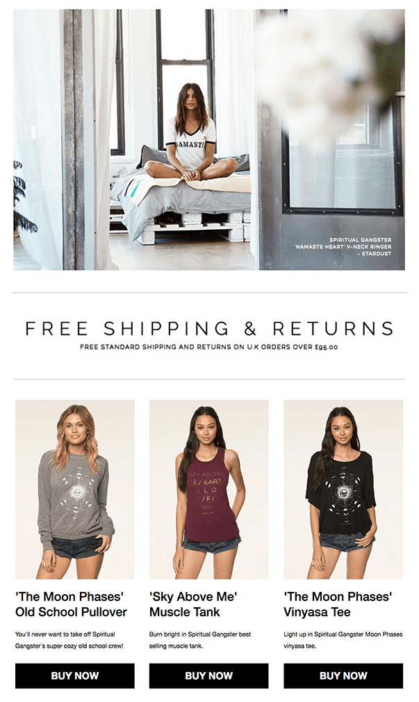
People are visual creatures—particularly in ecommerce! In your online store, your product pages always feature beautiful and detailed images, so your shoppers can essentially feel like they’re examining your product up close and personal—just like they’d be in a real-world store. So if you’re already using visuals on your site, help your newsletters convert with greater success by also including rich images in your emails.
Studies show that images boost content’s conversion rates, precisely because we are visual creatures.
Plus, images are also excellent at helping the pacing of your content. They act almost like subheadings, breaking up your content into more digestible parts for easier reading and retention.
Calls to Action
The call to action is the star of your email newsletter because the entire goal is naturally to get people to click on “buy” or “shop now” under or beside each product recommendation. It’s arguable, therefore, that the CTA is the most important element of your entire email newsletter. While all the other elements are vital, too, and have to be optimized for your emails to perform well, the CTA really makes or breaks your email.
Let’s examine everything that can go wrong with your newsletter CTAs:
- They’re too small
- They’re not obviously clickable
- Their button copy is hard to read
- They fail to stand out from the rest of the email
- They’re not in an obvious or sensible spot
Several things can go wrong with your CTAs!
That’s why it’s necessary to take your time with them and craft them to:
- Enjoy great color contrast from the rest of the email and background
- Have huge button copy to make them easy to read
- Be of a significant size so your readers easily notice them
- Use a bit of a shadow, gradient or other 3D depth effect to make them obviously clickable
- Use action-oriented words
- Be close in position to your product images in the email
Make Your Email Newsletters Count!
Your email newsletters are prime advertising for your ecommerce store. They bring relevant products to your recipients in personalized emails that connect with their buying behaviors and interests. They also serve as spectacular announcement opportunities for sales, discounts and any other promos your store’s running.
But the design is what counts. It’s not enough to fire off regular email newsletters to your customers, even if you’ve personalized them and their content is relevant. It’s only when you implement these top design tips into your own newsletter design that you will enjoy greater conversions and, consequently, greater sales. So get cracking!


