Most of the visitors your ecommerce store receives won’t make a purchase, no matter desirable your products are or how well you’ve priced them. At least not on their first visit. People need time to do research and come to a decision before they’re ready to make a purchase. This is especially true for online stores where potential customers can’t physically see or interact with the product before buying. Continue reading below for some of the best ways to Capture Email Addresses.
In fact, 92% of consumers are not ready to make a purchase on their first time to visit an online retailer. Instead it is only on later visits that people become customers.
As many first time visitors will never return to your site, you need a way to remarket to these people so you can increase the likelihood they’ll come back and make a purchase.
One of the most effect ways to achieve this is by collecting email addresses.
Email is one of the most effective channels, especially for ecommerce stores. The average return for every dollar spent on email marketing is a massive $44. Harnessing your website traffic to grow your email list is therefore essential to your ecommerce success.
Achieving this is not always that easy, however. People tend to be hesitant when it comes to handing over their email address, especially when it’s on a website they haven’t visited before. So in addition to offering an incentive for people to opt into your email marketing, you need efficient ways to capture email addresses.
But how do you get email addresses of website visitors?
As a digital marketer, you need to come up with increasingly novel ways to increase your conversion rate when it comes to getting email addresses of website visitors.
To help you with your email signups and to grow your list, here are some of the most common, as well as creative ways of capturing email addresses of web visitors.
1) Popups
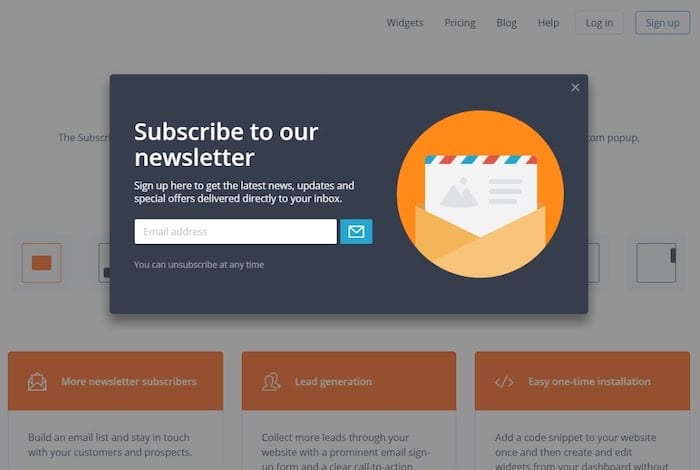
Popups are probably the most popular means of collecting email addresses on the web at the moment. No doubt you have encountered them popping up in the middle of your screen as you while for the page to load. Their ubiquity across the internet is due to two factors: the ease of setting them up and their effectiveness.
Adding a popup to your site with an email form highly effective way to increase the number of signups you receive. Their ease of setting up and low cost, including SmartrMail’s own free popup, adds to their appeal. This also makes them something you should definitely try out on your site too.
The only downside to popups, however, is that they can be irritating to some people. Particularly when someone struggles to find how to exit out of the umpteenth popup that’s blocking what the content they’re after for the day.
If you’re concerned about this happening to your visitors, there are some variations on the typical popup that you can use to make them less intrusive.
Build your Popup and collect customer Emails today!
? Install SmartrMail and build your popup ?
2) Exit Intent Popups
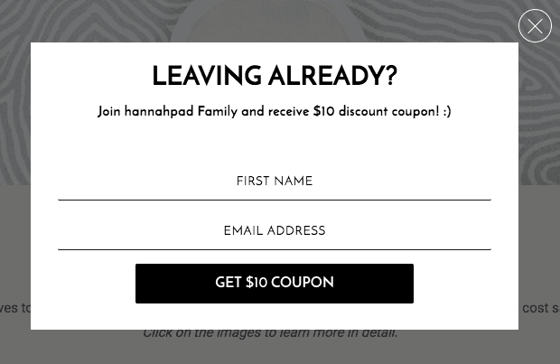
Exit intent popups only appear to users when they are about to leave your page. These are relatively new and rely on tracking people’s mouse movements to detect when someone is about to click off your page.
These popups are ingenious for two reasons. Firstly, they don’t get in the way of visitors and the content they came to your site for. Secondly, having the popup flash onto the screen a split second before someone leaves causes people to immediately stop what they’re doing and pay attention to the popup.
When combined with other email collection methods, these popups essentially give you a second chance to capture email addresses
3) Delayed Popups
Another effective way to avoid having your popups annoy visitors is to only have them appear after your visitor has met a certain criteria. Common examples of this criteria include having spent a certain amount of time on your site, visited two or more pages, or has scrolled so far down your blog posts.
The disadvantage of delaying your popup is that fewer people who will see it. Having less people see your popup will likely mean fewer signups as well. However, it does mean that the people who stay on your site long enough to be present with the popup are probably more qualified leads and therefore more valuable to be on your email list, leading to better open rates when you send an email.
Determining whether delaying your popups is a good fit for your site will likely involve running a test. If you find that they don’t lead to a significant drop in conversions, then the annoyance you save your visitors might be worth it. Otherwise you can always get rid of the delay.
4) Sticky Top Bar

Displaying a small thin bar at the top of your page that stays at the top of your visitors’ screens as they scroll down the page will command their attention without being annoying.
Usually these bars are used to notify visitors of an update or announcement, but there’s no reason you can’t add an email address box to it and a subscribe button. Being in such a visible part of your site, you ensure that everybody is given the opportunity to sign up to your email list if they want.
Including an incentive offer alongside this telling visitors why they should sign up and giving the bar a bright color to stand out will lead to even more conversions. When DIYthemes added a top bar to their site, they gained an additional 1,180 email subscribers in just 30 days.
Hello Bar is a great service that lets you easily add a top bar on your site.
5) Sidebar Forms
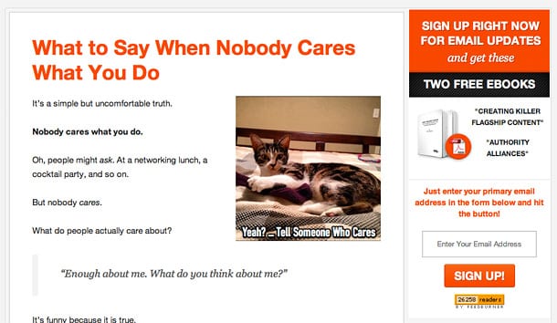
Sidebars are a common navigational feature of many websites. While their primarily purpose is to provide visitors with links to other pages, there’s usually plenty of room to include other content in them as well.
Their width and that they continue down the length of your page makes them ideal for a rectangular graphic showcasing your opt-in incentive. Including a subscription box here will give it plenty of visibility without distracting your visitors.
If your site already has a sidebar that has a lot of free space, then trying this option is a no-brainer. For more crowded sidebars, see if there’s anything you can take out of it to make room for your email opt-in form. If you don’t have a sidebar, then creating one will likely require a moderately intensive site restructure. However if you’re struggling to get email signups, then it might be worth the effort.
6) Footer Subscription Form
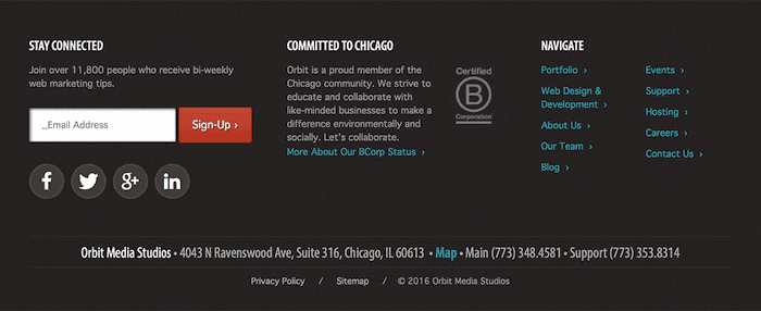
The footer is probably the most common location for a subscription box on websites. This means anybody who wants to sign up to your email list will often go straight to the bottom of the page expecting to see an opt-in form.
One advantage of these boxes beyond being where people expect to see them is that by appearing in the footer, they automatically appear across all of the pages on your site. So you only have to set it up once instead of manually creating them across all your pages.
While this is far from the most creative means of collecting email addresses of website visitors, it’s just an integral part of web design that including it is pretty much mandatory.
Sign-up to our newsletter and receive a free eBook with hidden Email Marketing Tips
7) Welcome Gate
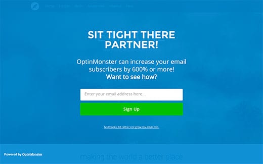
If a popup isn’t large or attention grabbing enough for you, then maybe welcome gates might be a better option.
Welcome gates are essentially full screen popups that cover the entire page. They will appear a second or two after the page starts to load to let people catch a glimpse of the actual page they’re visiting. This helps prevent people from mistakenly thinking they’ve visited the wrong site or clicked on the wrong link. This makes them appear very similar to landing pages.
As these welcome gates are very similar to being their own webpage, you should be careful with them showing to the same person multiple times. If someone who has already entered their details on welcome gate sees it again, they’ll want to exit from the form. This is where there’s a risk of them bouncing if they decide to just exit the page. To help avoid this from happening, ensure that the welcome gate isn’t shown to people who have already seen it and provide a clear and easy option for exiting the sign up form.
Being relatively new and not as common as popups, they don’t tend to be as annoying. This is especially true if you don’t make your welcome gate too aggressive in your attempt to get someone’s email address. Instead by including your opt-in incentive and politely asking for your visitor’s address will likely yield better results.
Justuno is a popular lead capture app that also integrates with SmartrMail.
8) Run a Competition
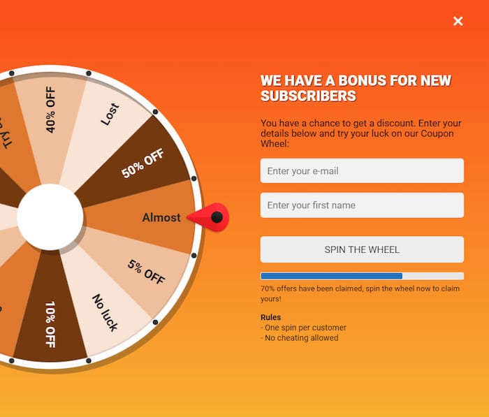
If you’re struggling to get signups with your opt-in incentive, then it’s probably worth improving your offer. Running a competition that people enter by signing up to your email list is a great way to improve your conversion rate.
For ecommerce stores, the reward can be as simple as a discount coupon, however the better prize, the more likely people will be to sign up. When it comes to running competitions to grow your number of email subscribers, this can be both a blessing and a curse.
Ultimately you want to grow your list with qualified leads who have a reasonable potential to convert into paying customers. If people are signing up purely for the possibility of winning the prize, then you risk cultivating a disengaged email list that won’t be that beneficial to your business. The goal here is to balance these competing factors so that you get a decent sign up rate without tarnishing your list.
To run the competition on your website, you can use apps such as Gleam that make doing so super simple. Gleam also lets you run competitions where you can choose from a very long list of activities potential subscribers must do in order to enter such as retweet a tweet or check-in at a particular location on Facebook.
Other options also include gamified popups such as Wheelio’s virtual spin wheel that gives people the chance to win a prize.

What To Do With Your Email List
Now that you’re aware of all the main ways to capture the email address of your website visitors, it’s time to start implementing them on your site.
Collecting addresses to add to your email list won’t do much for your business unless you actually send an email to your subscribers though. Email marketing campaigns are a great way to increase your sales.
If you’re looking for an easy way to automate your email marketing, then check out SmartrMail’s features. We make it easy for ecommerce stores to automate their email campaigns as well as quickly composing email newsletters. Our features include abandoned cart emails, smart segmentation, and triggered email campaigns with integrations with all the popular ecommerce platforms.

