Emails are vital for any eCommerce business. While marketing continues to evolve, and new communication methods are being developed constantly, emails remain to have the highest return on investment. With an estimated 306.4 billion emails sent and received each day in 2020, emails remain one of the most reliable channels to reach out to consumers. To reduce workload, merchants opt for automated emails. However, this type of email is a behaviorally-triggered one, relying on the consumer’s on-site activity. One should know that there are 5 transactional emails every merchant should have automated to save time and effort.
What is a transactional email?
A transactional email is sent by businesses during a customer’s interaction within the website or app — when availing a product or service, password resets, delivery information, receipts, and newsletters. It is the only type of email companies can send without the need to obtain the customer’s consent.
In this article, we will take a look at the different types of transactional emails merchants must automate, what are the best practices, and check out some examples from businesses delivering a delightful customer experience.
1. Registration email
Registration emails are sent when a prospect creates an account on your website or application. You usually see this in the form of a confirmation email when you sign up for the first time for a web service or an introductory email after you have completed the signup process.
HubSpot does an excellent job in welcoming new users to its website. Their confirmation email has a professional and straightforward design, isn’t distracting, and has one goal: to get you to confirm your email address and complete the signup process.
When automating automate a registration or welcome email, the best practices you must keep in mind are:
- Provide to them their credentials.
According to a study conducted by Digital Guardian, an average email address in the US is associated with over 130 accounts, and that 40% of consumers never use the same password. So, to help them out, make sure you include information on how they can sign in easily to their account, such as their login URL and/or username. This means they’ll always have it available when they inevitably forget their login credentials.
- Help them get started.
The user’s first login after signing up is a crucial part of acquiring new paying customers, specifically for web and mobile applications. You can use the registration email to provide links to videos, articles, and tutorials that they can use to familiarize themselves with your products or services. This increases your conversion rate —turning a website visitor into paying customers— and helps your business grow.
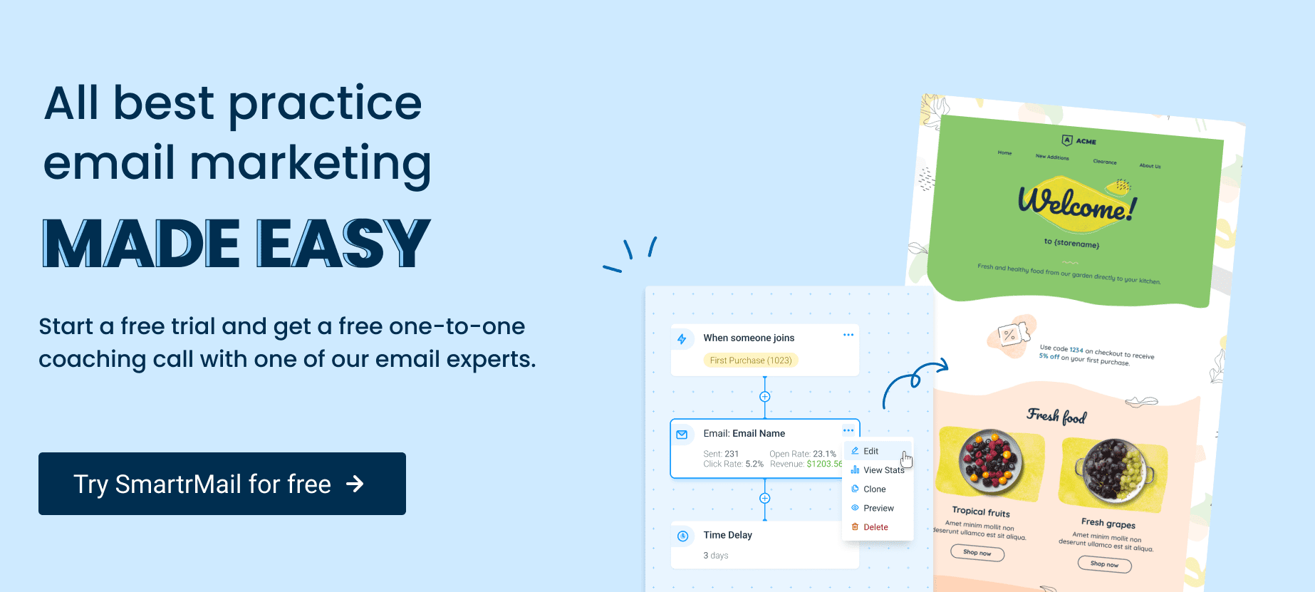
Get started with a 15 day trial with SmartrMail today
? Install SmartrMail get started with our 15 day free trial ?
2. Order confirmation email
Merchants send order confirmation emails once a customer has completed a transaction in an online store. This type of transactional email is unique to every customer and contains information such as who made the purchase, what was purchased, where will it be shipped or delivered, and how much it cost. It can also confirm a reservation, appointment, subscription, and other services you have agreed to provide your basic information.
Here’s an example of an order confirmation from DoorDash showing all the details of the product that the customer purchased. Aside from the primary goal of providing information, this email also has a secondary goal — to increase conversion rates by referring a friend.
Once you’ve determined the information to incorporate into the automated email, follow these standard practices when presenting and sending the confirmation to the customer.
- Emails must be sent right after every purchase.
Post-purchase emails establish the credibility of a company. By using email automation, there’s no excuse a confirmation email can’t arrive in a customer’s inbox soon after they placed the order.
Most people are excited about their purchases right after every sale. This is an opportunity to grow positive feelings about your business and engage your customer. Consider sending a separate shipping confirmation email once the customer’s item has shipped.
- Establish your brand.
The email is your means of communicating with the customers and is an extension of your website and brand. You have to consider creating an email design that makes a lasting impression. Make it visually appealing and use colors from your brand palette.
It is best to leave the email designing task in the hands of a marketing team to coordinate with the rest of your branding. Put your brand voice to work and create email templates to make sure future projects stay on track.
- Subject line engages customers.
Customers will likely refer to this email more than once, so use a clear and straightforward subject header to make it easier for them to locate it in a cluttered inbox.
Here are classic subject headers that work very well:
- Order confirmation.
- Your [insert name of business] order confirmation.
- Order number [insert order number].
- Your order has been received.
- We’ve received your order.
- Thanks for your order.
- Thank you for your recent order, [insert customer first name].
Don’t forget to incorporate some enthusiasm into the subject header to help generate excitement before the customer open’s his or her email.
- An opportunity to engage more with your brand.
Order confirmation emails provide basic information about the transaction that matter most to the customer at this moment, but there’s an opportunity to use it to build brand loyalty.
- Suggest other products the customer might be interested in.
- Offer a discount or incentive to shop again.
- Invite the customer to connect on social media.
- Ask the customer to subscribe to a mailing list.
- Promote your brand’s loyalty program.
Keep in mind that this should not be the highlight of your order confirmation email. Any invitation to connect must be discreet or should only take up a small part of the email. This should not be the primary CTA.
- Emails must be mobile-friendly.
It’s critical that emails look as sharp on both mobile devices and the desktop. Customers might check the status of their order while waiting for their coffee or standing in a queue at the supermarket; in fact, 60% of people check their email while they’re on the go.
Crowded, hard-to-read emails, off-screen texts, and misleading links inevitably frustrate the customer. Provide a seamless experience by making sure your email renders well no matter which device the customer is using.
3. Password reset email
When we speak of data security, users want to be sure that you are on their side. When they need to change their password, regardless if they forgot it or just want to update, you must provide them with this opportunity in a way that you won’t lose their trust. Although this email is very functional, it doesn’t mean it has to be boring.
Take a look at how Slack’s password reset email displays their brand. A prominent logo helps the recipients quickly recognize the email sender. Its conversational and concise copy builds on the brand’s tone of voice, and the bold CTA button completes the purpose of the email.
It’s also worth considering to let customers know when a password reset link will expire. If they don’t use it right away, they know that they must request another one – preventing unnecessary emails to your support team.
To make a neat and relevant password reset email, here are the best practices to consider:
- Make it really short.
It may sound odd but you can create a password reset email with only one sentence. 1 illustration, 1 sentence, and 1 straightforward CTA is possible and can make your users happy. They got the opportunity to reset their password without the unnecessary information.
- Add a meaningful banner.
Banners are always a great idea for email’s key message — recipients will immediately understand why they have this newsletter in their mailbox once they open it. Plus if you’re a design-related company you can refresh the user’s memory of how good you are at your job.
- Separate the password reset link from the password reset button.
You better prevent users from committing errors that will end you up replying to their irate message. There will be times that buttons will not work, and to avoid this scenario, add a separate reset link. Thus, users will be able to reset a password even if the button doesn’t work.
Additionally, if a user didn’t request a password reset, you can inform him or her to ignore the email and reassure that the password will not be changed, unless they click the password reset button.
- Send a confirmation email.
Nowadays, people have multiple accounts and use unique passwords — which leads them to forgetting it at times. In some cases, they even forget that they have already reseted their password and the next time they try to log into their account, they will get frustrated as to why their password is incorrect. It sounds weird but this really happens. To avoid this scenario, it would be best to send a confirmation email stating when the user changed his or her password.
- Adding a logo or visual brand attribute.
Most people are more attentive to images than texts. Users will surely recognize your email at a glance once you include the logo of your company at the top of the email. This is one of the most critical password reset email design tips you should keep in mind.
- Include details on the expiration time.
This is among the best practices for password reset emails. Security experts recommend using links that cease in a short period (preferably in 24 hours), thus no one else would be able to use the link again. Highlight the expiration time so the recipient won’t miss it.
4. Cart abandonment email
Shoppers replicate their window shopping on malls by adding products to their online shopping cart. In March 2020, 88.05% of online orders were abandoned. With the easy access to the Internet today, people have more information and they do research before purchasing a product online. This means there are various reasons why they don’t complete their transaction and abandon their online shopping carts.
Here’s a cart abandonment email from Adidas, telling a customer that he or she has left something behind, and provided an option to customize the shoe model to convince him or her to complete the purchase.
When optimizing inactivity emails for your organization, consider these best practices:
- Engage shoppers by sending multiple emails.
Sending three different emails in an abandoned-cart campaign results in higher conversion revenue. Set up a simple drip campaign that includes the following emails:
- Email #1
Cart reminder email – If customers don’t return to your site to check out within an hour, send an email reminding them that their cart is still available.
- Email #2
Follow-up reminder – This email must be sent 24 hours after the first email. If you’re running a sale, add a sense of urgency by informing customers that a sale is ending soon and products will be at full price afterward.
- Email #3
Promotional incentive email – The last email you should send up to seven days after the cart was abandoned. If shoppers still haven’t proceeded to checkout, include a discount offer for items already in their cart.
Depending on the email marketing software you use — for example, SmartrMail — do some testing first to figure out exactly what follow-up time frame gets the most shoppers back to your site.
- Use a killer subject line.
Subject lines should not sound spammy because this loses the consumer’s trust on your email and will prompt them to move you to their spam folder. Come up with a creative, humorous and light-spirited subject line that will encourage people to read the email.
Here are a few examples of subject lines that are effective in getting shoppers to stop scrolling and open the email:
- You don’t want to miss out on these!
- Your items feel lonely – help them out!
- Uh-oh! Looks like you forgot something.
- Hey! Come back here! Pretty please?
The best practice to take note in sending cart abandonment email is to test different subject lines to figure out which one gets shoppers to open your email.
- Write a copy to encourage action.
Boring content doesn’t do anything to get shoppers to make any action. Even if it’s automated, the email’s human element is crucial for getting people to feel connected to you and complete the checkout process.
Shoppers should feel like you genuinely care that they’ve left items in their cart. Send emails like you’re writing it to a close friend with an engaging and conversational tone Your copy should aim for the following:
- Remind shoppers about their items.
- Create urgency around completing the purchase. For example, say something like, “Your cart is expiring soon.”
- Make shoppers feel good about the products they’re looking at.
- Use social proof.
Since shoppers can’t physically check the product to decide whether the item is worth their money, using social proof is the best option to create urgency. Depending on why shoppers abandoned their cart — the price might be too high — social proof provides insight into the other shopper’s experience.
If shoppers know the product’s benefits, quality, and why you are offering it at that price, there’s a good chance that they will complete their purchase. Incorporate reviews and testimonials to influence purchasing decisions. Choose your best reviews and testimonials from your website and include them in your emails.
5. Feedback email
A feedback email requests consumers who’ve made a recent transaction in your business to share their experience. This can be a request to submit a review about the product you purchased, rate a recent online shopping experience, or leave a rating to a service you recently availed.
Dropbox sends this email after you contact their support team. It clearly reaffirms the support provided and asks for feedback on their services.
If you want to get more responses from your customers and ensure those responses are helpful and accurate, here are some of the best practices you need to follow.
- An attention-grabbing email subject.
When sending out a feedback request, never use the words “Help” and “Reminder” because these words can decrease your open rate. Instead, words that worked better are “Invited,” “Invitation,” and “Urgent.”
Using the recipient’s name is also effective in increasing the email’s open rate. Consider also providing a time estimate to give the recipient confidence that you are not wasting their time.
- A personalized salutation.
Always start feedback emails with a personalized salutation to show your customers that the email is not composed and sent by a robot. This also proves to them that you are not spamming and sending emails randomly. A simple “Hi” or “Hello” with the recipient’s name will do just fine.
- Tell them why they receive the feedback request.
A short reminder why you’re asking for feedback helps frame the context of your request. Don’t make it long – just a short and straightforward sentence is enough.
- Tell them how their answers will help your business.
Customers like the feeling of being valued and would want to get some benefit out of a deal. So, if they feel like you’re only using the survey to generate more revenue, they will not be interested in the email at all.
It’s really necessary to tell them exactly how their answers are going to improve their experience. Just be honest.
- End with a “Thank you” and a CTA.
You’re almost done setting up your feedback email, all that’s left to do is:
- Thank them in advance – even the simple act of saying “Thank you” or “Thanks” makes people feel more favorably towards you.
- Provide a CTA – Once clicked, this will send the recipient to the feedback page or survey.
Conclusion
Hundreds of thousands of transactional emails are sent every day and they have become an essential part of every customer’s purchasing journey. Since it is the users who trigger transactional emails, the open rate is higher than a promotional one. If used correctly, transactional emails can positively impact the engagement and reputation of your brand.
Author’s Bio:
Philip Louie Gelantaga-an is a Content Writer for PinnacleCart who writes compelling, informative, and timely content. His years of writing experience in the freelance and corporate setting has given him a vast understanding on the different businesses and topics, ensuring the delivery of high-quality content. When not working, he enjoys painting and sketching landscapes and portraits.

