Continue reading below for Unique Welcome Email Examples to Inspire Your Own. Your welcome emails are one of the most important automations you’ll set up.
Not only are they one of the first emails your customers will receive, and therefore your chance to make a great first impression, but they are also among the most engaging emails you’ll send.
Compared to regular emails, welcome emails enjoy an 86% higher unique open rate, 336% greater transaction rate, and make a whopping 320% more revenue on average.
Your customers also expect to receive a welcome email with three-quarters expecting to receive one immediately after signing up for your email list.
With so many people opening and reading your welcome emails, you’ll want to make sure you put your best foot forward.
That’s why we’ve put together this list of 10 of the best welcome email examples we’ve seen to help inspire your own email design.
Welcome email examples
1) Starbucks
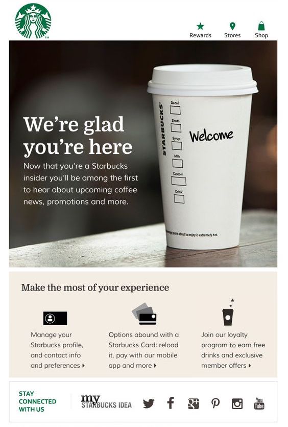
Starbucks takes the number one spot not because it has a standout email design but because it’s an excellent demonstration of welcome email best practices.
The first thing that draws your attention is the simple yet effective “we’re glad you’re here” message that provides a warm welcome to new subscribers. Immediately beneath this they also set expectations for what email content people should expect to receive.
These are both elements you’ll want to replicate in your own welcome email.
Additionally, the email contains call-to-actions for how people can make the most of their Starbucks experience and includes links to their social media profiles.
The image of the coffee cup with welcome written on it is also a great way they’re managed to tie in their product in the email design.
What we liked about this example
- Nails all the welcome email best practices
- Good use of imagery
- Warm welcome
2) LUSH
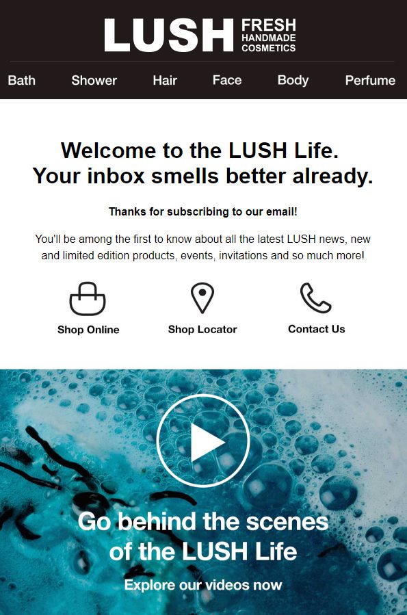
LUSH’s welcome email is another example that gets the best practices right.
There’s the welcome and thank you message, the setting of expectations, and some call-to-actions.
The “your inbox smells better already” line is a great example of them working their product into their email copy as well.
What stands out about this welcome email and what takes it a step above the Starbucks example is the inclusion of a video.
Including a video in your welcome email, or any email campaign for that matter, is a great way to boost engagement rates and let you showcase your products and store.
What we liked about this example
- The inclusion of a video makes it more engaging
- The link “your inbox smells better already”
- Satisfies all the welcome email best practices
3) Food52
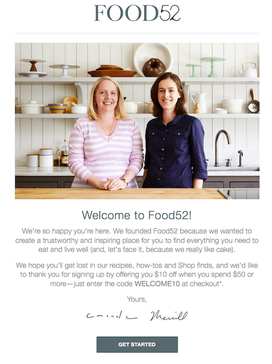
Food52’s welcome email takes a slightly different, yet incredibly effective, approach.
While they’re still giving customers a warm welcome and setting expectations, they’re also adding a personal touch by including a photo of their founders and touching on their company mission.
Presenting the human side of your store not only builds trust but also builds up your brand image in the minds of your customers.
Over the long run, taking a brand-building approach with your email marketing will help improve your overall conversion rate.
What we liked about this example
- The message from the founders
- Photo of the founders in a kitchen
- The signature signoff
4) Casper
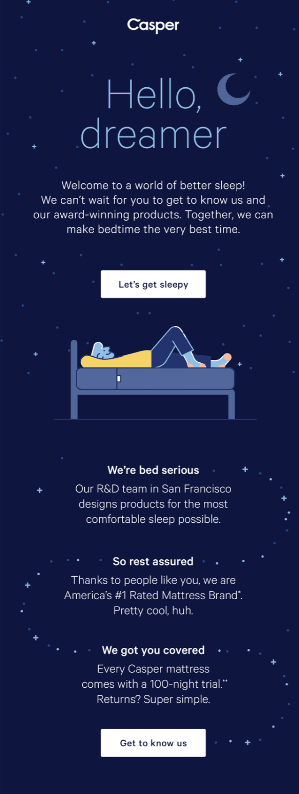
Casper’s welcome email is an example of another brand talking about its mission and company values in a less personal way.
While they might not be including an image of their founders or talking about what the original source of inspiration behind Casper was, talking about their commitment to providing their customers the “most comfortable sleep possible” will still go a long way at building up their brand.
They do this by sharing their main unique selling points (or USPs): good design, rated #1, and their 100-night trial.
The other thing worth mentioning about this welcome email example is its design.
The design is simple yet on-brand and pleasing to the eye. This makes the experience of opening and reading it more enjoyable which creates a great first impression.
What we liked about this example
- The email design
- The inclusion of their unique selling points
- How they talk about their product
Get Started on your Welcome Emails with SmartrMail today
? Install SmartrMail and Automate your Welcome Emails ?
5) Away

Instead of, or in addition to, talking about your brand, you can also talk about your products in your welcome email.
After all, it’s your products that customers will end up buying and welcome emails are a great opportunity to showcase them.
Because Away has a relatively simple product offering, they’ve listed all the main features of their suitcases in their welcome email. This ensures that people know what makes their suitcases stand out from their competitors’ and why customers should purchase theirs.
This is something definitely worth considering with your own welcome emails.
What we liked about this example
- How they talk about their product’s features
- The call-to-actions
6) Glossier
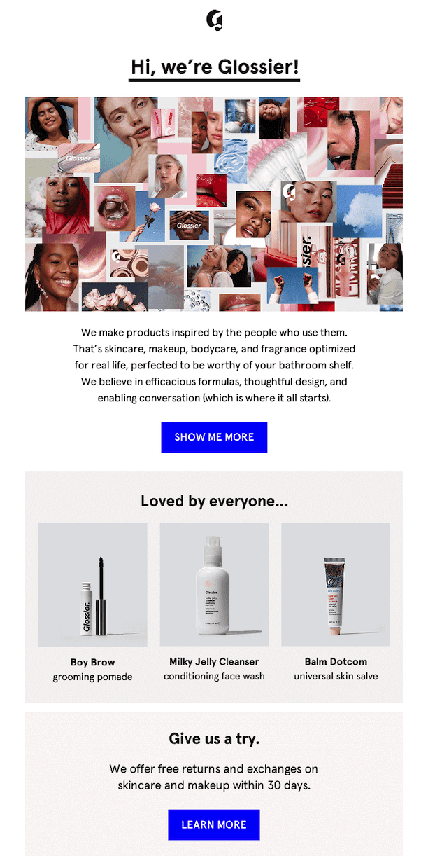
Glossier’s welcome email is a good example of one that showcases products when they have a much more expanded and varied product offering.
In this example, they’ve opted to highlight some of their most popular products.
This is an effective way to ensure that the products appeal to the greatest number of people possible and therefore enjoy a high conversion rate.
If you want to do something similar with your welcome emails in SmartrMail, you can include a recommended product block. You can then set it to the ‘Best Sellers’ product feed.
This will then automatically add some of your best-selling products to your welcome email but also customized based on the individual customer’s preferences.
What we liked about this example
- The inclusion of a selection of their most popular products
- The use of images of customers using their products
Sign-up to our newsletter and receive a 30% discount on your first 6 months with SmartrMail
7) Michael’s
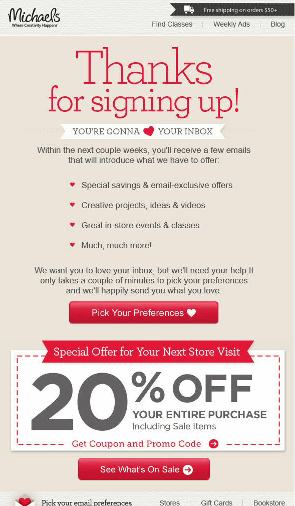
Switching gears a bit, Michael’s welcome email is centered around providing customers with a special offer.
Not only is this a great way to increase conversion rates by incentivizing additional purchases, but promising a special offer in exchange for signing up for your email list will also grow your list quicker.
Of course, the welcome doesn’t just contain the offer, but also the other essential elements like a welcome message, setting expectations, and call-to-actions.
What we liked about this example
- The large ‘thank you’ message
- Get all the best practices right
- Clear call-to-action buttons
8) Jen Sincero
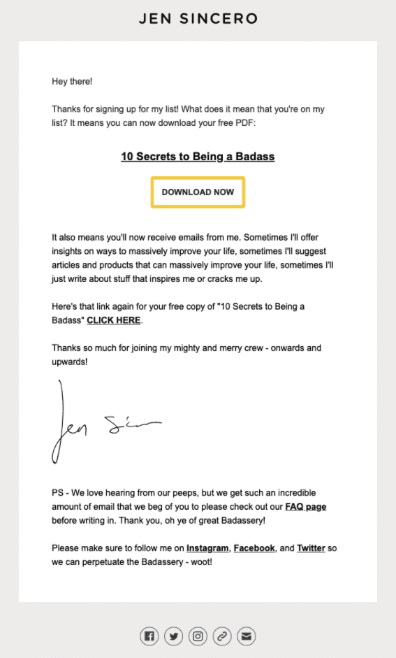
This welcome email example from Jen Sincero is essentially a plain-text design that might be something you consider replicating.
This kind of email design can come across as less of a marketing campaign and more as a personal email from the founder.
The reason why it’s included on this list however is not its email design, but that it’s rewarding new email subscribers with a free PDF.
This demonstrates that your email list opt-in incentive doesn’t have to be a sale offer or discount code. Downloadable content like guides, ebooks, etc. can work just as well, if not better at incentivizing sign-ups and don’t sacrifice margin in the process.
What we liked about this example
- Doesn’t look like a marketing email
- Offers something different from the usual coupon incentive
- The signature signoff
9) Kate Spade
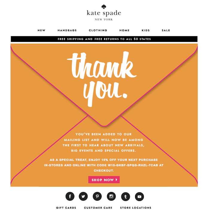
A radical departure from the last welcome email example, this campaign from Kate Spade stands out with its unique email design.
While it does include a 15% discount offer, it’s clear that the main goal of the welcome email is to welcome customers and thank them for signing up.
Making this message the most prominent part of your welcome email design will make your customers feel more appreciated and less of just a means for more sales.
What we liked about this example
- The email design
- That the thank you message is more important than the special offer
10) Huckberry
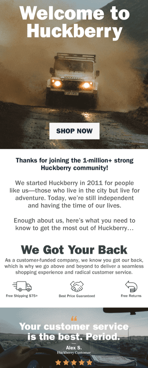
Lastly, this welcome email from Huckberry incorporates an element that’s been missing from all the other examples on this list so far: social proof.
This example includes social proof in a couple of ways.
First, it mentions that they have over 1 million customers in their ‘community’ and second, it also includes a 5-star review from a customer at the bottom.
Including social proof like this in your welcome emails will go a long way in building trust and increasing the conversion rate of your campaigns.
What we liked about this example
- The inclusion of a 5-star customer review
- How it talks about joining a ‘community’ and just an email list
- The ‘we got your back’ section
Own your welcome emails
Now that we’ve gone through 10 great examples of welcome emails, you’ll hopefully have plenty of ideas and inspiration for your own welcome emails.
But creating a high-performing welcome email campaign takes more than just getting your email content right.
For example, you’ll want to give it a good subject line to ensure people open your email to begin with. That’s why we’ve also put together a collection of welcome email subject lines and strategies.
For absolutely everything you need to know about welcome emails however, be sure to check out our comprehensive welcome email guide here.

