10 of the Best Email Newsletter Examples to Inspire Your Own
Sending regular newsletters is an incredibly important part of email marketing. Not only does it keep your customers engaged but they’re also a great way to generate sales.
And you likely already know this, seeing as you’re searching for email newsletter design inspiration.
Instead, you’re looking to improve the performance of your newsletters by looking at and learning from some of the best examples out there.
That’s why we’ve put together this list of our 10 favorite examples from some of the top online merchants.
And instead of just throwing the emails together and calling it a day, we’ve also broken down what we think works well in each newsletter example along with some suggestions for improvements.
So let’s get into it!
Email newsletter examples
1) Rise and Shine
Rise and Shine uses their email newsletter to provide their customers with information on two topics that are very closely aligned with their product offering of natural sleep drinks.
Providing educational content related to your products is a great newsletter content idea. It’s also an excellent way to promote your products within the guides or explainers without coming across as too promotional or salesy.
Beyond having a simple and clean email design, the other thing this newsletter does well is not including all the content in the email itself.
Instead, they use call-to-action buttons to entice people to click through to their website. This helps improve click-through rates and prevents the email from becoming too long.
2) Trunk Club
Whether it’s a newsletter or automation, the best emails are sent with a single purpose in mind. And in this newsletter example, that’s to promote Trunk Club’s new summer collection.
But instead of just simply including some of their best items in the newsletter along with some ‘buy now’ buttons, they’ve instead put together a helpful style guide.
Just like holiday shopping guides, style guides are a fantastic newsletter idea to engage your customers and generate sales while also providing help and assistance.
The “keep your cool” call-to-action button completes the simple and elegant email design and keeps the newsletter laser-focused on achieving its single aim.
3) Tattly
Customers appreciate openness and honesty. So a great way to build a relationship with your customers is to open up and share something personal in a newsletter.
This could take the form of struggles or hurdles you’ve had to overcome to get where you are now, a personal story about why you decided to set up your store, or by sharing some lessons you’ve learned like Tattly has done in their newsletter above.
Doing this humanizes your brand and while it might not lead to additional sales right away, taking this brand-building approach will pay dividends in the long run.
4) Care/of
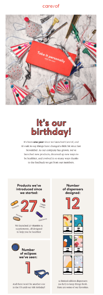
Another great brand-building newsletter idea is to share any milestones or accomplishments your brand has achieved.
Whether you’ve just served your 1,000th customer, been in business for exactly 5 years, or just shipped your 10,000th order, any milestone your store has achieved that’s worthy of celebration also makes for great newsletter content.
Sharing this kind of news, like Care/of has done, is also a great and subtle way to demonstrate ‘social proof’. After all, if you’ve sold so many products, people must like what you’re selling.
5) Outer
Speaking of social proof, this newsletter from Outer is a great example of social proof being used in a much more direct manner. It does this by including reviews from previous customers.
While this content is not going to work as a weekly newsletter, at least without quickly annoying your customers, it makes for a great idea for potential customers on your email list who haven’t made a purchase yet.
And it doesn’t have to be reviews about your business in general either. If you’ve just launched a new product, you could dedicate a newsletter to sharing positive reviews of it which you could then send to your entire list.
But of course, to send newsletters like this you’ll first need to be actively asking your customers for reviews.
6) Away
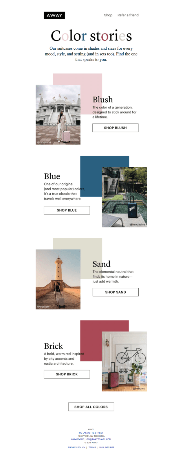
Every month Away sends their customers a newsletter that highlights or showcases their products in a different way. In this example, they’ve decided to highlight how colorful their products are.
This has allowed them to create a stunning and high-quality email design with the help of user-generated content from their social media.
The color theme also extends to the call-to-action buttons that invite customers to shop their products by color.
7) MiMOKO
This is an example of a rather long email from MiMOKO that takes the form of a monthly update.
In it, they curate a variety of their best content from the month, showcase some of their newest products, and provide some tips on how to use their planters and vases. This ensures there’s something in their newsletter that interests every customer.
The real standout aspect of their newsletter design, however, is their use of product photography. This use of high-quality photos helps people visualize the products in their own homes and gives additional inspiration for the products’ uses.
This makes this newsletter example one where the images speak for themselves.
8) Ben & Jerry’s
Ben & Jerry’s newsletter is a good example of an on-brand email newsletter with its quirky tone and interesting factoids.
The inclusion of a blog post on political and social issues, something most brands would stay well away from, aligns well with the Ben & Jerry’s mission of “using the company in innovative ways to make the world a better place.”
Again, taking this brand-building approach and showing commitment to their company values will help customers feel connect to the brand and strengthen their loyalty. As opposed to just cramming as many products and sale offers as you can into your newsletters.
9) Jins
This newsletter from Jin’s is a more traditional example where various different products are included and customers reading it are encouraged to visit their online store.
What works well about this particular newsletter is how they’ve arranged the elements in a hierarchical structure with the most important message and call-to-action at the top.
The secondary pieces, listed under the “Find out more about Jins” subheader, have their images and call-to-actions alternate left and right down the email.
This makes for a more interesting layout and helps guide customers’ attention down the email.
10) Ritual

Ritual’s newsletter is another example that gets the hierarchy right.
This time the bright yellow color and product image is used at the top, above the fold, to grab people’s attention right when they open the email before diving into more nitty-gritty details.
The other elements naturally flow from one to the next and utilize the same color and fonts as their website. (A good idea to keep in mind if you’re struggling to come up with your own email design as replicating your website design helps with creating a sense of familiarity and brand recognition.)
The other good thing about this email design is the contrasting blue call-to-action buttons.
Having the call-to-actions (one of the most important parts of your newsletter design) contrast with both the yellow and blue backgrounds improves the click-through rates for the newsletter.
Conclusion
Now that you’ve gone through our collection of stunning email newsletter examples, you hopefully have the inspiration you need to create your own amazing newsletters.
Just remember to structure your newsletters so that the most important information is at the top, there is a call-to-action that stands out and don’t forget you don’t have to constantly be pushing your products.
If you’re looking for some newsletter templates that you can easily use for your online store, then you should consider SmartrMail’s free plan.
SmartrMail integrates natively with Shopify, BigCommerce, PrestaShop, WooCommerce and Maropost stores and includes a variety of high-quality newsletter templates.

