Continue reading below for 5 of our favourite Abandoned Cart Email Template Design Tips With Examples. If you’ve successfully established your ecommerce store and started making sales, you will almost certainly know about shopping cart abandonment. And no, we’re not talking about the kind where physical shopping trolleys are left on the street. Online shopping cart abandonment is when someone places an item from your store into their online cart, but then for one reason or another, doesn’t complete the transaction.
With the average cart abandonment rate sitting at a whooping 69.23% and approximately $4 trillion worth of products being abandoned each year, it’s the bane of many ecommerce store owners. However, for savvy ecommerce marketers, this presents a massive sales opportunity.
Being able to recover sales from abandoned carts will lead to more sales and profit for ecommerce store owners.
The most popular means to recover these lost sales in ecommerce are with abandoned cart emails. These emails are automatically sent to people who fail to complete the checkout process as a reminder to complete the transaction.
These emails are among the most effective you can be sending. We’ve found that on average, each abandoned cart email generates $27.12 in sales for ecommerce stores.
While these emails are very popular with ecommerce store owners and can be highly effective, not all abandoned cart emails are created equally. Their effectiveness ultimately comes down to how well they’ve been designed and implemented.
In order to help you get the most out of your abandoned cart emails, we’ve identified the five most important elements when it comes to their design.
1: Include Details of the Abandoned Products
This first tip might seem like a no brainer, however details of the product or products someone has abandoned often goes missing from many abandoned cart emails.
By skimping on details, someone who has completely forgotten about what they were going to buy may not be adequately reminded by your email. The email below, for example, only includes the products’ titles and very brief descriptions.
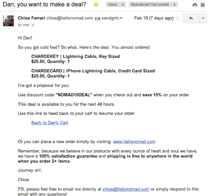
When sending your abandoned cart emails, you want to take the opportunity to include all the relevant details that you can.
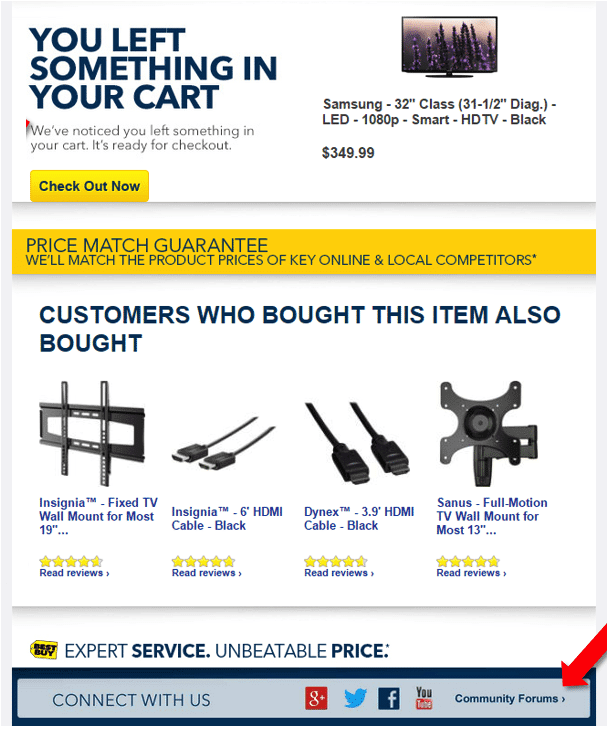
Having a clear description of the items as well as a nice high-res image will not only remind people of what were going to buy, but also of why they wanted it in the first place. You might also want to consider adding product reviews to give potential customers that final push they need to go ahead and make the purchase.
The email below does a good job at including these details.
2: Include a Clear CTA
A call-to-action, or CTA, is perhaps the most important part of any marketing material. This is because it tells people what action they should engage in next. For abandoned cart emails, this will be to complete the transaction.
After reminding your would-be customer of what they wanted and why they wanted it, you want to make it as easy as possible for them to head back to their cart and finalize the transaction. The harder it is to get back to their cart, the more likely you’ll lose them again before they find their way back.
For instance, the abandoned cart email below provides no clear means of getting back to the person’s shopping cart.
The easiest and most seamless way to let someone get back to their cart is to include a large, unmissable button that sends them straight back to their cart. Such as in the example below.
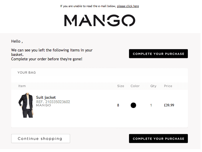
The ‘Complete Your Purchase’ buttons in this email provide a clear path for the recipient to continue on after reading the email and deciding to make the purchase. This will ultimately result in a higher conversion rate for their abandoned cart emails meaning more sales.
3: Include As Few Links As Possible
Once you have included a clear CTA to take people back to their carts, you will then want to start eliminating any unnecessary links.
This is because you want to do everything you can to increase the likelihood that someone will click on your CTA link. Every click elsewhere is a click that could’ve been on your CTA.
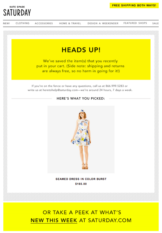
Take the yellow Kate Spade Saturday email that’s lacking a CTA back to the recipient’s shopping cart above. This email contains a banner in its footer encouraging people to check out their latest products.
Even if this email contained a link straight to one’s cart, there’s a good chance that many people would be distracted by the opportunity to view the newest products. Spending time viewing these products increases the likelihood that they’ll forget about their shopping cart again and fail to convert.
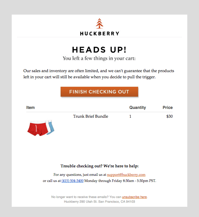
The email from Huckberry below is a good example of an abandoned cart email with as few links as needed. In fact, the only other link is the unsubscribe link which is necessary to include to be compliant with CAN-SPAM.
4: Ensure Your Abandoned Cart Email is Mobile Friendly
If you’re only designing emails to look good on desktops and leaving mobile as an after-thought, you’re well and truly behind the times. Over half of all emails are opened on mobile. This means that how your emails look on smaller screens is just as important as how they render on desktops.
With abandoned cart emails, you therefore definitely don’t want to be limiting yourself to just those who open emails on their laptop or desktop.
You want to ensure there’s just as much chance that someone will convert if it was opened on their smart phone as if it was opened on anywhere else.
Ensuring that emails look great across all the different types of phones out there can be challenging. We understand this frustration. That’s why abandoned cart emails sent with SmartrMail are designed to display correctly no matter what size screen they’re displayed on.
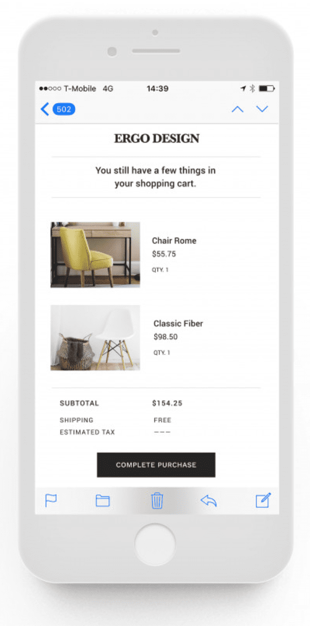
Up until now we’ve only shown you examples of abandoned cart emails as they appear on desktops, however the email below is a good example of responsive mobile design.
Sign-up to our newsletter and receive a free eBook with hidden Email Marketing Tips
5: Include an Incentive
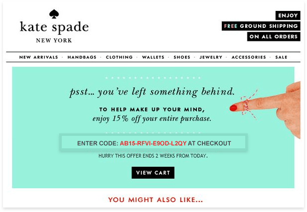
While not a design tip per se, the effectiveness of including an incentive in your abandoned cart email makes it worthy of a mention.
The top two reasons people abandon their online shopping carts according to UPS and comScore are unexpected shipping costs and leaving the site to find a better price elsewhere.
Seeing as price sensitivity plays a major role here, including a coupon code in your email or offering free shipping if you don’t already, can go a long way to converting more people.
If you’re hesitant to include a discount for people who simply forgot about their purchase and would’ve paid the full price, multiple abandoned cart emails might be of interest.
With SmartrMail you can automate up to three different abandoned cart emails.
The first email can simply be a reminder email. This email will then catch the people who simply forgot about their purchase. In the second or third follow up email you can then include a discount or free shipping to catch people who didn’t complete the purchase due to the price.
Abandoned cart emails are a powerful tool for ecommerce stores to recover lost sales and boost their bottom line. By implementing these design tips, they will be performing at their absolute best and brining you even more sales.
If you’ve ever stumbled upon a website that hasn’t been updated since the early 2000s, you’ll also know that design trends change rapidly in the digital space. That’s why, in addition to these tips, it’s also important to keep up to date with changing design trends.
If you’re looking at setting up abandoned cart emails, SmartrMail makes the process super simple for you. We plug in with Shopify, Bigcommerce, Neto, and WooCommerce stores and offer a 15 day free trial.
Install SmartrMail on your store here.
Read summarized version with

