The new school year is on the horizon and that means you’re probably looking at getting your back to school emails ready. Back to school season also happen to be the second biggest shopping season of the year. So it is better to take inspiration from the right emails to amp up your game.
But as you’re reading this post, you’re probably unsure of how to design your back to school emails. Or maybe you have a few designs in mind, but are wanting to see what types of emails other retailers are sending.
Whatever your reason, we’ve put together this list of 10 great back to school email examples to help get you inspired with your own email campaigns.
1) Boden’s Hopscotch Back to School Email Design Highlighting School Supplies

There’s little people associate with schoolyards more than hopscotch. That’s why it’s immediately apparent that this is a back to school type of email from Boden.
It’s also an ingenious way of organising all of the various back to school supplies Boden has on offer. The black background lets the colorful clothes stand out even more.
If we had any suggestions for how this email could be improved, it would be to better highlight the 15% off and free shipping offer. While this is stated at the very top of the email, the bold design beneath it detracts attention from it.
Get Started on your Back to School Series with SmartrMail today
? Install SmartrMail and Automate your Back to School series ?
2) The ABC Email from Paperchase’s As Easy That Focuses on Essential School Supplies
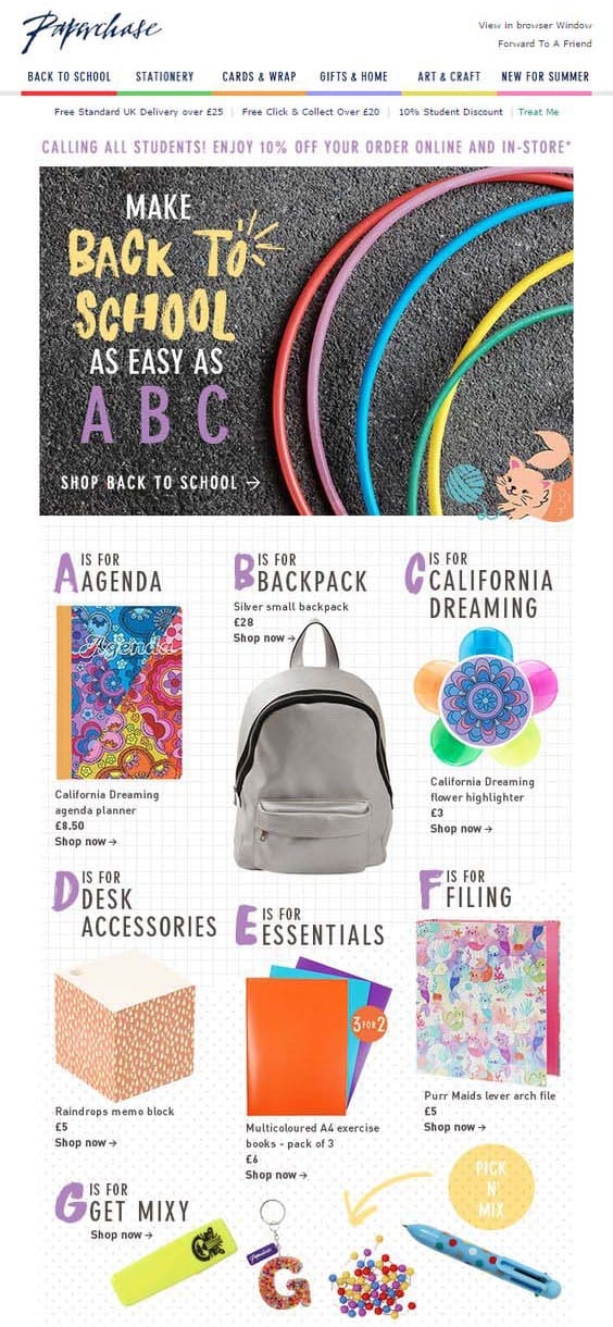
If Boden’s back to school email was too dark for you, then this colorful email design from Paperchase might be more your style.
Like Boden, Paperchase has come up with a clever way to showcase many of their back to school sale items with an ‘as easy as ABC’ theme. In order to save space, we cut this email off at ‘g’ but the email itself goes all the way to ‘z’.
By going through the alphabet, Paperchase is also reminding parents of all the items they may have left off their back to school shopping list.
However just like with Boden’s email, Paperchase’s free shipping and discount offers aren’t that visible.
3) Zara’s Head Back to School Email That Focuses on Style
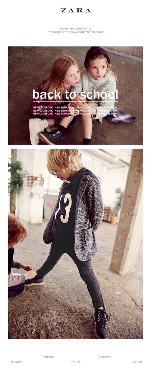
Zara’s back to school email is incredibly simple yet effective. Sometimes all you need is a couple of high quality images to showcase your best products and a link to your store.
Of course, Zara is a well known brand so they can get away with very little details in their emails. You’ll probably want to include more details such as your back to school savings offer or what types of school supplies you’re selling. That said, this email is an excellent example of keeping it simple and remaining on brand.
4) Gaiam’s Back to School Email Announcing a Competition
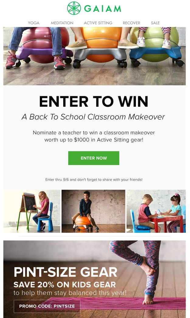
Instead of focusing on what they’re selling, Gaiam’s back to school email campaign focuses on running a competition.
This is also not your ordinary back to school competition where a student or parents wins school supplies either. Rather it’s focused on teachers.
Teachers are often underappreciated, especially at this time of year when they’re usually expected to pay for classroom supplies themselves. By focusing on teachers and getting their subscribers to show their appreciation, customers will end up feeling good about purchasing from Gaiam.
Sign-up to our newsletter and receive a free Calendar with all the most important key eCommerce dates that you shouldn’t miss in 2024
5) Grammarly’s Back to College Email Targeting College Students
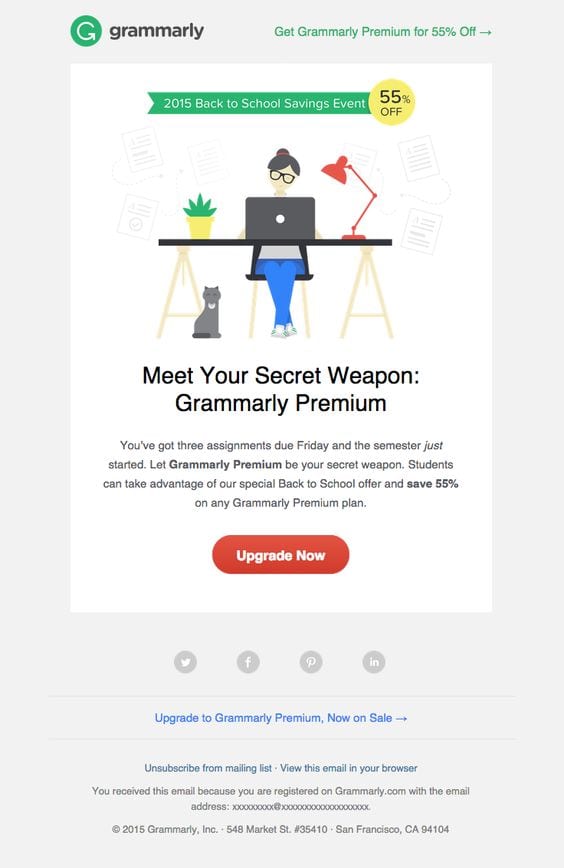
Teachers are not the only group marketers often forget about with their back to school campaigns. College students represent another incredibly lucrative group at this time of year. Especially when back to college sales outperforms back to school sales.
Grammarly’s email, while not exclusively aimed at college students is definitely more geared towards them with a simple and clean design. There’s also a clear call-to-action button and their 55% off offer is well highlighted.
6) Kate Spade’s Fresh Start to Back to School Campaign

Kate Spade is an elegant brand and their back to school email is well and truly on brand.
While others will try to incorporate a back to school theme in their email design by opting for childlike designs with chalkboards, colored pencils etc. Kate Spade managed to communicate a clear back to school theme while keeping their email design incredibly elegant.
They have also cleverly listed the products they’re promoting in a pop quiz format to further reinforce that this is a back to school sale.

7) Toms’ Feel-good Email About Back to School Season
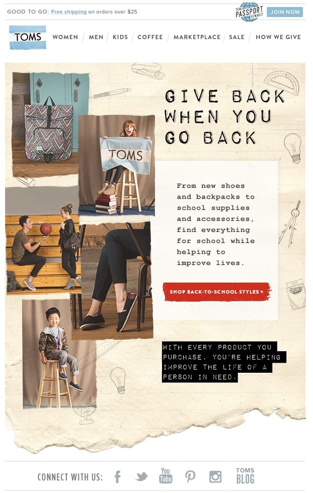
Toms’ back to school email is all about giving back when you go back. It’s also a well designed email with a clear call-to-action getting people to ‘shop back to school sales’.
In case you missed it again, this email also contains a free shipping offer (located at the very top). While the email is more concerned about Toms’ charitable efforts, this could still be more visible for subscribers.
8) Clarks’ Back to Business Targeting All Younger Generations
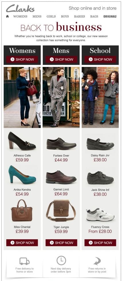
Clarks aims to expand the scope of back to school sales by including anyone who’s heading back to school, college or work.
As many parents will already be out buying school supplies for their kids, it makes sense to get them to buy a few items for themselves. Especially if they’re returning to work after a summer break.
9) Simple Back to School Email to Draw Attention
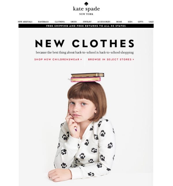
Another back to school email from Kate Spade. This one however is much more simple while still being elegant and true to the Kate Spade brand.
It goes to show that you don’t need to come up with anything too fancy for your back to school email. A simple high quality image is often enough to communicate that it’s a back to school email.

10) Urban Outfitters Email lists Most Frequently Forgotten Items

Urban Outfitters’ back to school email is in the format of a literal shopping list.
Interestingly, all the items are not your typical back to school supplies. While people are unlikely to add all of these items to their own back to school shopping lists, chances are most will add at least one or two of them.
Having the list on graph paper also reinforces the back to school theme.
Over to You
Don’t let your newly found inspiration go to waste. It’s now time to start composing your own back to school emails.
Of course, coming up with a great email design is only one part of a successful email marketing campaign. It’s completely useless if people aren’t opening the email.
That’s why a great subject line is important to make your email stand out in your subscribers’ inboxes. If you’re unsure about how to achieve this, we have a guide on writing great email subject lines along with a list of 100 back to school subject lines that’ll help you out.
If you’re looking for more general tips, we also have a more general guide on acing your back to school email marketing campaigns. The guide moves beyond just email design to tips on when to send your back to school emails, who to target and other tactics to increase sales.

