Email inboxes during Black Friday weekend are not a pretty sight.
Between the aggressive red banners, the countdown timers, and the endless BIGGEST SALE EVER subject lines, it all blurs into ignorable noise.
But every year, a handful of brands break through. They create emails people want to open, read, and most importantly, buy from.
What separates these winners from the forgettable masses? Turns out, it’s not always the biggest discount or the flashiest design.
Sometimes it’s gamification that creates anticipation. Other times it’s radical simplicity that commands attention through restraint. Or it’s understanding that during the chaos of mass shopping events, your brand voice matters more than ever.
Let’s dissect 21 standout Black Friday emails to uncover the psychology, strategy, and creative decisions that made them work.
Real Black Friday Email Examples from Top Brands
We’ve analyzed hundreds of Black Friday campaigns to find the ones that stand out…not just visually, but strategically. These emails come from different industries, aesthetics, and promotional philosophies.
However, they all share one thing: they understand their audience and give people good reasons to act.
Let’s break down what makes each of these campaigns work, so you can adapt the strategies that fit your brand.
HUX Health

This email from HUX hits you with urgency right from the jump – “last chance” paired with a bold 30% off message that’s impossible to miss. We’ve noticed that HUX likes to keep things straightforward. This email shows that: here’s the deal, here’s the code, here’s the button.
Why we love the email: The scarcity messaging (“These prices won’t come around for a while”) creates genuine urgency without feeling manipulative. The visual hierarchy is perfect – your eye travels naturally from the discount to the code to the CTA.
Plus, repositioning a sale as “investing in your health for 30% less” is a clever psychological move that makes spending feel responsible.
The takeaway: Black Friday emails don’t need to be cluttered with multiple offers and chaotic layouts. Sometimes a single, strong discount with clear urgency is all you need. You just have to make the value proposition clear within three seconds of opening.
HUX Health

RŌKA goes for that premium minimalist vibe with this one — all black everything with their sunglasses floating like they’re about to drop the hottest album of the year.
The BLK FRI DAY typography is giving modern architecture feels with those spaced-out italics, which is a nice departure from the usual screaming red banners.
See how they’re selling “fan favorites” at 30% off, which is smart framing; beyond a discount, it’s access to the cult classics everyone else is already obsessed with.
Why we love the email: The design aesthetic is confident; they’re not cluttering the frame with multiple products or desperate countdown timers. By highlighting fan favorites instead of just pushing their entire catalog, they’re using social proof and making the choice easier.
The takeaway: Premium brands can (and should) maintain their elevated aesthetic even during Black Friday chaos. Treat the sale as exclusive access rather than a desperate clearance. Sometimes the most effective urgency is the subtle implication that people are already in on this deal.
PRESS

PRESS is serving sage green serenity with their Green Friday spin. It’s a clever little eco-conscious rebrand that lets them lean into their plant-based values while still capitalizing on the shopping frenzy.
The muted color palette and elegant serif headlines create this calm, aspirational energy that’s the complete opposite of typical Black Friday chaos.
Why we love the email: The Green Friday reframing is genius for brands that want to participate in the sales bonanza without compromising their sustainable values. The sage green color scheme is brand-consistent and creates a sense of calm that stands out in a sea of red and black emails.
The takeaway: You don’t have to play by Black Friday’s traditional rules. If garish red banners and aggressive countdown timers don’t align with your brand, reimagine the holiday entirely. This email proves you can be zen and sales-focused at the same time.
Copper Cow Coffee

Copper Cow Coffee is bringing major aesthetic energy with this one. The pink and burgundy color story is warm and inviting, a refreshing palette swap from the usual Black Friday aggression.
What’s immediately different here is they’re not running the sale on their own site, they’re directing you straight to Amazon, which is an interesting play that reduces friction for impulse buyers already in shopping mode.
Why we love the email: The Amazon redirect is a bold move that acknowledges where their customers are actually shopping during Black Friday. Instead of fighting that behavior, they’re meeting people where they are.
Plus, that product photography is doing serious work in the desire department.
The takeaway: Don’t be afraid to rely on third-party platforms during major sales events, especially if that’s where your customers are already shopping. Also, tiered discounts on specific product categories can actually increase conversions compared to blanket site-wide sales.
Booking.com

Booking.com goes full wanderlust with that carefree beach photo. They’re pushing 30% or more off stays, but the real hook is the flexibility. You can book between specific dates, stay until end of 2024 and there’s free cancellation. The personalized “Genius Level 3” touch at the top is a nice flex that makes you feel VIP.
Why we love the email: They’re selling experiences and flexibility. The specific booking window and extended stay period removes the use-it-or-lose-it pressure that kills travel deals.
The takeaway: For service-based products, flexibility can be more valuable than the discount itself. Clear parameters (dates, terms) actually increase conversions by reducing decision paralysis.
Projects Watches
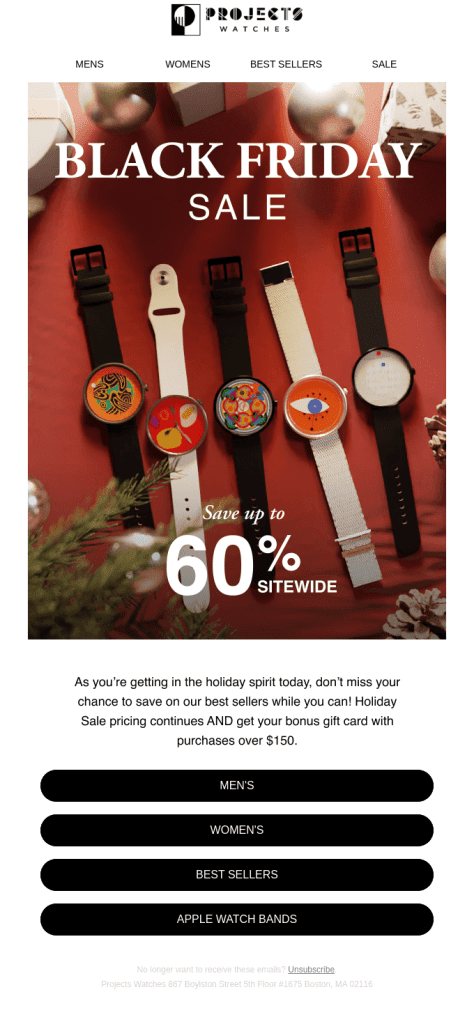
Projects Watches, unlike what we had before, embraces maximalist holiday chaos with a flat lay of their artistic timepieces surrounded by ornaments and festive drama. That’s very “gift guide energy.” That massive 60% sitewide is impossible to miss, and they’re sweetening the pot with a bonus gift card on orders over $150.
Why we love the email: The gift card incentive on top of the discount creates a double-dip dopamine hit.
The product photography also shows personality and variety without overwhelming, and those bold CTAs eliminate any “what do I click” confusion.
The takeaway: Stacking incentives (big discount + gift card) can push people over the purchase threshold, especially for gift shopping.
When offering huge discounts, you also have to simplify navigation to three to four clear paths maximum.
Summer Solace

Summer Solace brings that boutique candle aesthetic with moody lighting and elegant script typography announcing Black Friday Early Access.
The 20% off feels almost understated compared to others, but they’re adding value through freebies. You are also getting travel candles over $150, gift cards over $200.
Why we love the email: Calling it Early Access instead of just a sale creates exclusivity and rewards loyalty.
Moreover, the tiered free gift structure encourages higher cart values without screaming about it. That cozy candlelit imagery also adds quite a lot of emotional effect.
The takeaway: Premium brands can maintain mystique by framing sales as exclusive access rather than desperate discounts. Tiered free gifts also often outperform straight percentage increases in driving higher order values.
Summer Solace
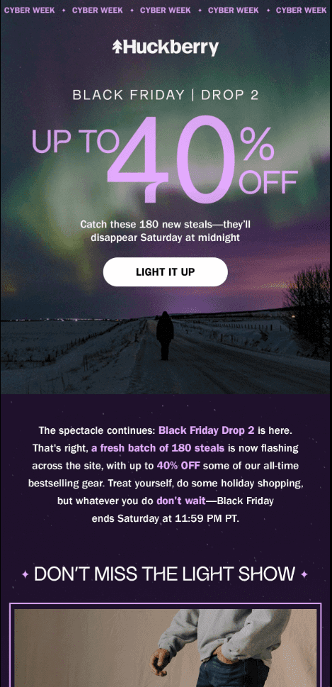
Huckberry’s playing the drop game like they’re selling sneakers, not outdoor gear — “Drop 2” with 180 new deals that vanish Saturday at midnight. They’re gamifying scarcity by releasing deals in waves rather than dumping everything at once. This keeps people checking back and creating multiple urgency spikes throughout the weekend.
Why we love the email: The drop model borrowed from streetwear creates repeat engagement instead of one-and-done shopping. Naming specific numbers (180 deals) also makes the scarcity concrete rather than vague.
The takeaway: Serializing your sale into multiple “drops” can generate more total engagement than one big blowout. People will also return multiple times to see what’s new, and each wave creates fresh urgency and social sharing moments.
Lonely Planet
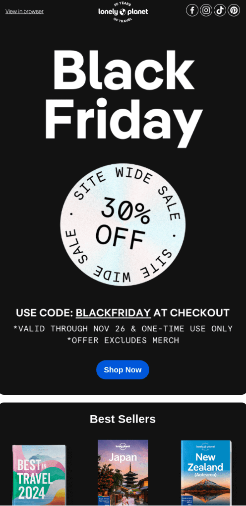
Lonely Planet goes full brutalist minimalism in its Black Friday email. You see a big black background, massive white typography, simple circular badge stamp for the 30% off. It’s anti-design as design.
They’re banking on brand recognition doing the bulk of the work. If you’re on their list, you already know what they sell, so why waste pixels?
Why we love the email: The visual austerity makes it feel authoritative and trustworthy rather than desperate. By stripping away all persuasion tactics except the discount itself, they’re signaling confidence.
The takeaway: Strong brands can succeed with anti-marketing during sales events. Sometimes the most attention-grabbing move is refusing to grab attention. Keep in mind that strategic minimalism stands out when everyone else is screaming.
Skillshare
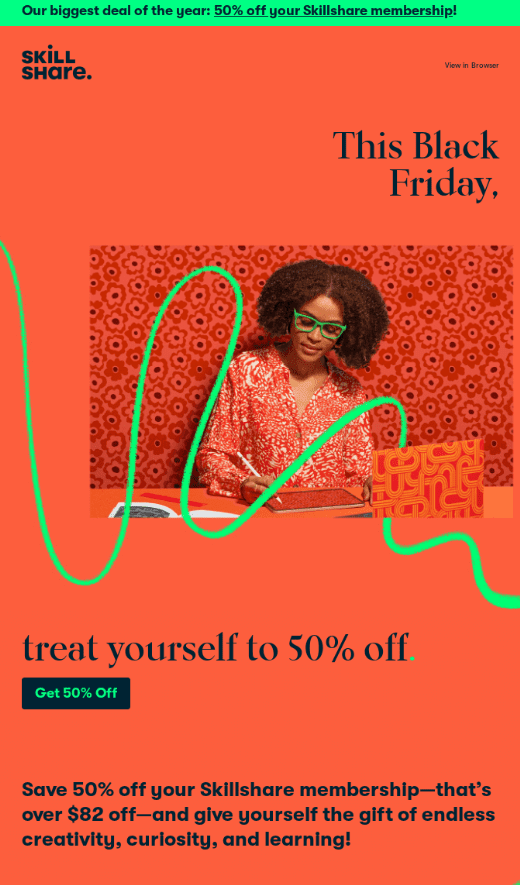
Skillshare, like many emails on this list, brings maximalist joy with that punchy coral-red-orange background and playful squiggly green lines that feel hand-drawn and spontaneous.
They’re selling self-improvement as self-care and reframing the discount as permission to invest in yourself rather than just saving money.
Why we love the email: The vibrant, optimistic design philosophy says learning is fun rather than intimidating. Reframing 50% off a membership as “treating yourself” taps into self-gift psychology during the holidays.
The takeaway: For intangible products or services, your design language needs to work extra hard to create desire. Position your offer as personal transformation or self-care rather than just a discount on access. Inject personality through color and design choices that reflect how people will feel using your product.
Priceline
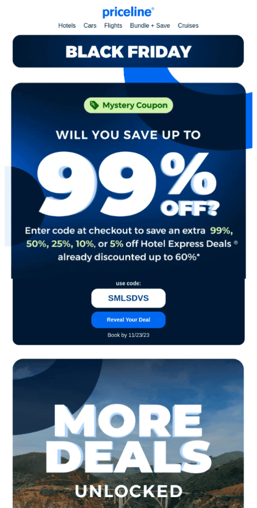
Priceline’s gamified uncertainty uses that lottery-ticket dopamine hit. The giant 99% teases the dream scenario while burying the reality that most people will probably get 5-10% off already-discounted deals.
The “Reveal Your Deal” button is pure slot-machine psychology; you have to click to find out what you won. They’re banking on the engagement mechanic itself creating commitment, so by the time you see your actual discount, you’re already invested in the journey.
Why we love the email: Variable reward schedules are addictive by design; not knowing what you’ll get creates more anticipation than a fixed discount. The MORE DEALS UNLOCKED teaser below keeps the treasure hunt going. It transforms shopping into an interactive experience.
The takeaway: Gamification can bring engagement even when your actual discounts aren’t that spectacular. The mystery and reveal create their own value. People often feel better about a personalized 15% they had to unlock than a boring flat 20% everyone gets.
Nike

Nike keeps it iconic with black background, massive typography, gold accent on the 60% that gives luxury vibes despite the discount. The “STARTS NOW” urgency banner and swoosh flanking feels almost militaristic. This is swoosh privilege; they don’t need to convince you they’re worth buying, just tell you when the gates are open.
Why we love the email: Brand confidence lets them skip the persuasion theater entirely. The gold accent on black creates premium perception even during a sale. Simple navigation reduces friction when you’ve already got people’s attention.
The takeaway: If you’ve got strong brand equity, don’t dilute it with desperate tactics. Announce your sale like an event people should feel lucky to access.
Soundstripe
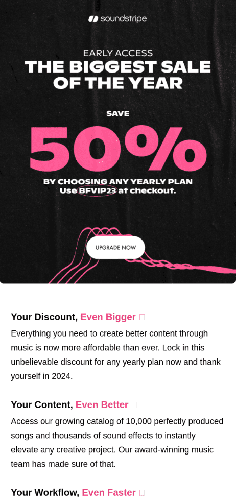
Soundstripe uses Early Access framing to make subscribers feel special you’re seeing this first.
They’re selling value amplification: “Your Discount, Even Bigger” and “Your Content, Even Better” frames this as leveling up what you already do rather than just saving money. The copy focuses on future you thanking present you and positions the purchase as future self-care. It’s aspirational economics.
Why we love the email: The “early access” psychology rewards existing audience loyalty and creates tiered FOMO. Moreover, framing around content improvement rather than just cost savings taps into professional ambition.
The takeaway: For B2B or creator tools, emphasize outcome improvement over price reduction. People buy professional tools to level up their work, not to save money. Make them visualize their better future self, then position your discount as the unlock code.
Headspace
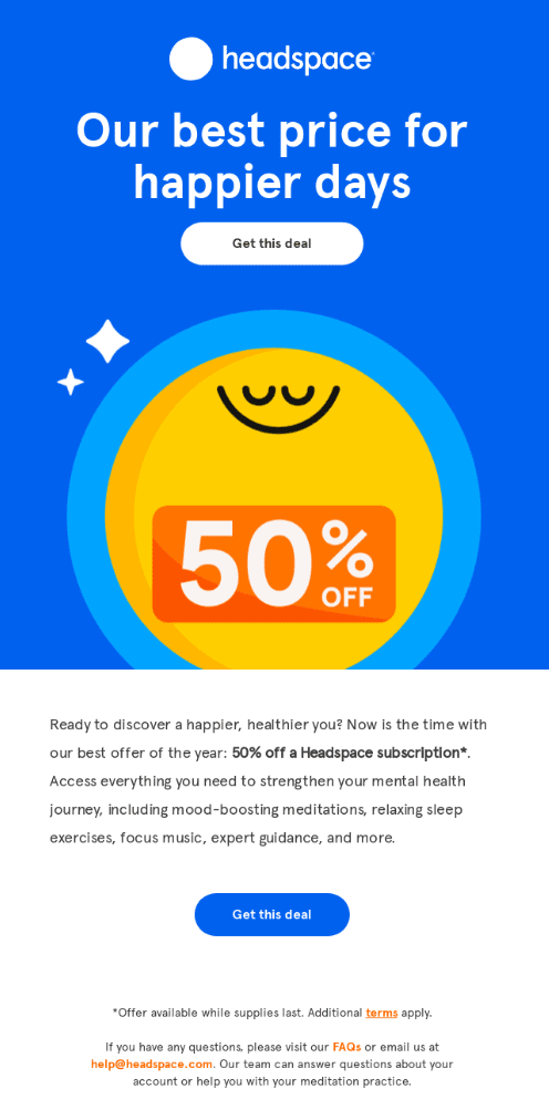
Headspace goes really wholesome with that cheerful yellow emoji face practically radiating calm energy against the dopamine-blue background. They’re selling mental wellness, not a product, so the copy avoids transactional language entirely. “Our best price for happier days” positions the discount as emotional ROI. The illustration style feels like a meditation app designed by Pixar – friendly, accessible, non-threatening.
Why we love the email: The emotional framing turns a subscription discount into self-care permission. The visual simplicity and warm color palette create calm in the storm of aggressive sale emails.
The takeaway: Wellness and self-improvement brands can counterprogram against Black Friday aggression. When everyone’s screaming, whisper. Position your discount as an act of self-compassion rather than savvy shopping.
Backcountry
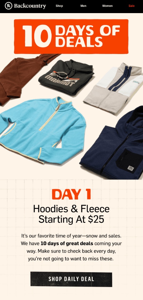
Backcountry’s stretching Black Friday into a 10 Days of Deals advent calendar situation, launching Day 1 with hoodies and fleece at accessible $25 entry points.
By serializing deals across 10 days, they’re training people to check back daily and building habit loops that extend engagement way beyond a single Friday panic-buy.
Why we love the email: The countdown mechanic creates sustained engagement rather than one-hit conversion pressure. Starting with accessible price points also lowers barrier to entry while the daily rotation prevents decision paralysis.
The takeaway: Extended sale events with daily rotations keep your brand top-of-mind throughout the entire shopping period and create multiple conversion opportunities. You might also try starting with low-priced hero products to build momentum and capture budget-conscious shoppers early.
VidAngel
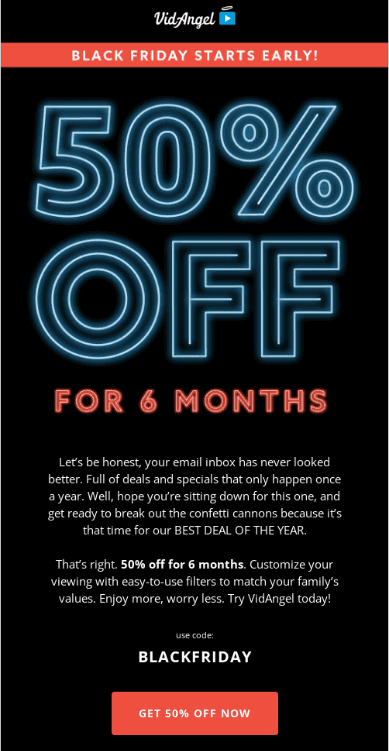
VidAngel’s hitting you with electric neon typography that looks ripped from an ’80s arcade. The conversational copy acknowledges the chaos with humor before positioning their offer as the rare worthy interruption. They’re selling 6 months at half price for a family filtering service, so the “break out the confetti cannons” enthusiasm feels earned.
Why we love the email: We like how the self-aware copy about inbox overload creates rapport and disarms skepticism. Offering 6 months instead of annual creates a lower-commitment entry point that still generates substantial CLV.
The takeaway: Acknowledge the elephant in the room (inbox fatigue, deal overload) with humor and honesty to build trust. Visual distinctiveness also matters; if your category typically uses certain aesthetics, zig when they zag.
Zoom
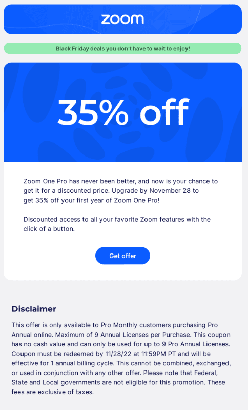
Zoom’s doing corporate-safe Black Friday with their signature blue and that oddly calming mint green banner announcing “deals you don’t have to wait to enjoy”. The 35% off is solid but not shocking, and they’re upfront about it being for their Pro tier with a specific deadline (November 28).
What’s notable is the wall of legal text at the bottom – they’re prioritizing transparency over persuasion, which tracks for B2B software where trust matters more than hype. It’s the email equivalent of wearing business casual to a house party.
Why we love the email: The anti-urgency framing acknowledges subscription fatigue and positions this as convenient rather than pressuring. For B2B tools, the detailed disclaimer actually builds credibility/ They’re respecting your intelligence by being explicit about terms.
The takeaway: B2B and enterprise products should lean professional even during consumer shopping holidays. Over-explaining terms can actually increase conversion for considered purchases where buyers need to justify spend to others.
The Pro’s Closet
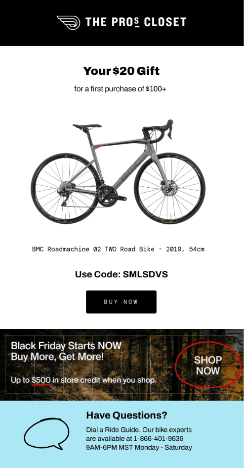
The Pro’s Closet leads with a “$20 Gift” incentive on $100+ orders, then showcases a specific high-end road bike (BMC Roadmachine, casually mentioned as 2019 model) to establish credibility with serious cyclists.
The “Have Questions? Dial a Ride Guide” with actual phone hours shows they understand high-ticket sports equipment needs hand-holding.
Why we love the email: We like how the tiered incentive structure creates pathways for different customer segments without confusing the message. Featuring a specific premium product immediately signals they’re not selling department store bikes.
The takeaway: For high-consideration purchases, layer multiple incentive tiers to capture browsers and enthusiasts simultaneously. Lead with accessible offers to get attention, then introduce premium opportunities.
Orangewood
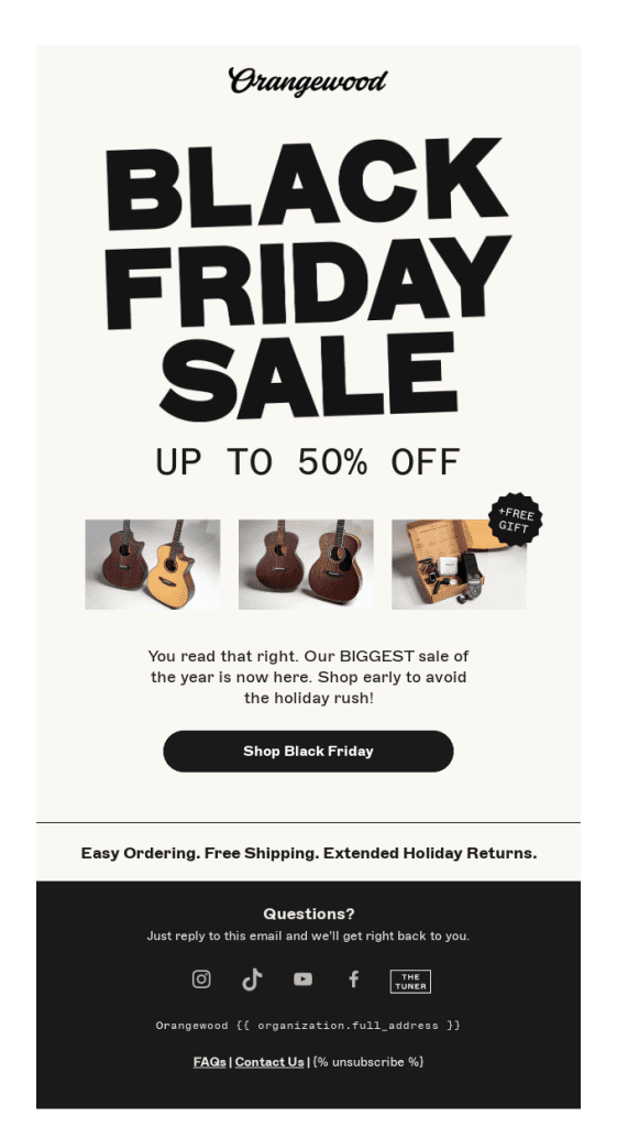
Orangewood Guitars goes refreshingly lo-fi with that hand-drawn script logo and bold, almost punk-poster typography for BLACK FRIDAY SALE. The three product thumbnails with the FREE GIFT badge are just enough to show variety.
They’re also building in friction-reducers at the bottom (easy ordering, free shipping, extended returns) because guitars are tactile products people worry about buying online.
Why we love the email: The rough-around-the-edges design feels authentic for a music brand… too polished would be suspicious. Leading with purchase anxiety reducers (shipping, returns) acknowledges the elephant in the room when buying instruments online.
The takeaway: Products that people traditionally buy in-person need to over-communicate logistics and returns. On top of that, design authenticity matters more than polish for creative and artistic categories.
Kizik
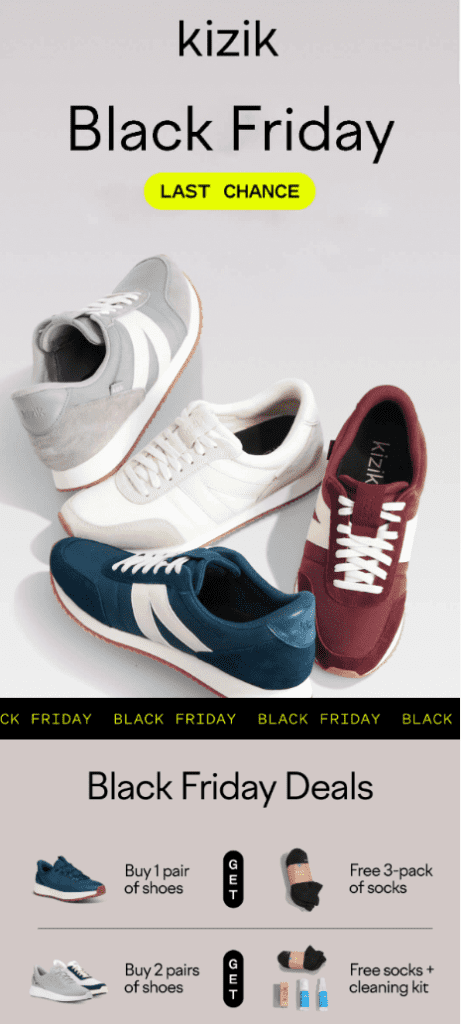
Kizik is running a tiered gift-with-purchase strategy: buy one pair, get socks; buy two pairs, get socks plus cleaning kit. It’s smart bundling that increases AOV while providing practical value because nobody thinks “I wish I bought fewer socks.”
Why we love the email: GWP (gift with purchase) strategies can outperform straight discounts by making people feel they’re getting bonus value rather than buying discounted goods. The tiered structure also naturally pushes people toward the two-pair purchase.
The takeaway: Gift-with-purchase can drive higher cart values than percentage discounts while protecting brand perception. Moreover, practical gifts (socks, cleaning kits) that complement the main product feel generous.
Ray-Ban (The Ones)
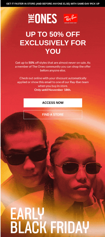
Ray-Ban’s exclusive members club “The Ones” is flexing access privilege hard. The “EXCLUSIVELY FOR YOU” and “before anyone else” messaging is status play and enough to turn a 50% discount into social currency. They’re emphasizing same-day pickup to reduce the dreaded post-purchase wait that kills impulse buys on expensive sunglasses.
Why we love the email: The exclusivity framing turns bargain-hunting into VIP access. Here, you’re not desperate for deals but just exercising your membership privileges. And same-day pickup removes a major friction point for instant gratification seekers.
The takeaway: Loyalty programs should make members feel elite, more so during mass-market sales events. Frame discounts as exclusive access rather than promotional necessity. For impulse-friendly categories, emphasize immediate fulfillment options like “buy now, wear tonight” beats “order now, wait a week.”
Note: These emails are sourced from Really Good Emails.
How to Plan Your Black Friday Email Campaign
Inspired? Good. Now you’re probably planning your own Black Friday email campaign!
But where do you start? What do you even do?
We agree its daunting, but the right tool makes it easy.
Built specifically for eCommerce brands, SmartrMail takes the complexity out of email marketing without compromises. You could be running a Shopify store, BigCommerce site, or WooCommerce shop, SmartrMail will integrate easily with your existing platform and turn your customer data into revenue-driving campaigns.
Here’s what makes SmartrMail particularly powerful for Black Friday:
- Personalized product recommendations: SmartrMail uses your store data to power product recommendation blocks in your emails. It looks at customer purchase and browsing behaviour, then suggests items they are more likely to buy, so your Black Friday sends can feature dynamic product grids personalized to each subscriber.
- Ecommerce-focused segmentation: You can quickly build “smart” segments based on factors like purchase history, average spend, order recency and email engagement. That makes it easy to send early access offers to VIPs, reminders to active browsers, and win-back offers to lapsed customers.
- Ready-made Black Friday and BFCM templates: SmartrMail provides branded Black Friday and Cyber Monday templates that pull in your Shopify store’s logo and styling, plus a library of promotional layouts you can customize by swapping products, colors and copy.
- Straightforward A/B testing where it matters most: The platform supports A/B testing for things like subject lines and some campaign settings, so you can benchmark which subject or preheader drives more opens and engagement.
- Cart recovery and other key automations: SmartrMail lets you run multi-step abandoned cart sequences, welcome flows, win-back series and other ecommerce staples, with optional product recommendations inside those emails
Here’s a practical Black Friday campaign structure you can build in SmartrMail:
| 7-10 Days Before: Teaser email to your most engaged customers announcing that something big is coming. Use mystery and anticipation without revealing the full offer yet.3-5 Days Before: Early access email to VIP customers and email subscribers. Give them first dibs on deals before the general public. Black Friday Morning: Launch email at 6-8 AM in your customers’ time zones with your full offer, clear CTAs, and prominent product recommendations.Black Friday Afternoon: Follow-up email to non-openers with a different subject line and angle – maybe emphasize different products or highlight a specific benefit like free shipping.Black Friday Evening: Last chance email to anyone who opened but didn’t purchase.Saturday-Sunday: Extended weekend emails for Cyber Weekend, possibly with fresh deals or “everything must go” messaging.Monday (Cyber Monday): Final push with your absolute last chance messaging and perhaps your strongest offer of the weekend.Tuesday: Thank you email to everyone who purchased, with potential upsell opportunities or referral incentives. |
Metrics to Track for Success
Running a Black Friday campaign without tracking the right metrics is stupid. You will get results, but they probably won’t be where you intended. Here are the metrics you need to monitor before, during, and after your campaign.
- Open Rate: It tells you whether your subject lines and sender reputation are finding their place in crowded inboxes. Track open rates by segment to understand which audiences are most engaged. Your VIP customers should have significantly higher open rates than new subscribers or lapsed customers.
- Click-Through Rate (CTR): It measures how compelling your offer and creative actually are. A high open rate with low CTR means people were intrigued enough to open but not convinced enough to take action. That’s a content problem, not a subject line problem.
- Click-to-Open Rate (CTOR): This is arguably more important than standard CTR because it measures how many people who actually saw your email took action. This removes the subject line variable and focuses purely on content effectiveness.
- Conversion Rate: This is the percentage of email recipients who complete a purchase. During Black Friday, conversion rates typically increase 30-50% compared to normal promotional emails because purchase intent is already high.
- Average Order Value (AOV): This often increases during Black Friday because shoppers are stocking up or buying gifts. However, steep discounts can sometimes decrease AOV as people buy only the discounted items.
- Cart Abandonment Recovery Rate: Your cart abandonment rate will spike (often to 80-85% compared to 70% normally) but your recovery rate should increase as well since you can sweeten the deal with your Black Friday offer.
Some Final Tips for Creating Memorable Black Friday Emails
After analyzing dozens of Black Friday campaigns, here’s the sauce that we found that separate the emails people ignore from the emails people actually buy from.
Segment early and strategically
Don’t wait until the week before Black Friday to think about segmentation. Start building your segments at least a month in advance based on purchase history, engagement levels, product preferences, and lifetime value.
Create specific segments for
- VIP customers (top 10% by LTV) who get early access and potentially better deals
- Recent purchasers (last 30-60 days) who might need different products but shouldn’t be ignored
- Lapsed customers (no purchase in 6+ months) who need win-back offers
- Cart abandoners (recent) who are already on the fence
- Engaged non-purchasers (open/click but never bought) who need stronger incentives
- New subscribers (last 30 days) who don’t know your brand well yet
Each segment should receive different messaging, offers, or timing. Your VIPs shouldn’t be getting the same generic blast as someone who signed up yesterday and has never engaged.
Use timers and scarcity indicators
Countdown timers work because they create visual urgency that’s harder to ignore than text alone. Dynamic timers that show hours and minutes remaining are more effective than static messaging because they create loss aversion in real-time.
However, your timers must be honest. If your sale continues after the timer expires, you’ve destroyed trust and trained customers to ignore future urgency cues. If you’re running extended sales, use new timers for each phase rather than moving the goalposts on existing ones.
Add surprise or gamified elements
Mystery discounts, scratch-off reveals, spin-to-win wheels, and progressive discounts based on cart value all add an element of delight that makes your emails more memorable than straight 30% OFF announcements.
The Priceline example we analyzed earlier with the mystery coupon that could be 99% off (but probably won’t be) taps into gambling psychology; the anticipation of the reveal creates engagement even when the actual discount is modest.
Just be careful not to make the game more interesting than the products. The mechanism should enhance the shopping experience, not replace it.
Keep design simple and on-brand
When inboxes are flooded with screaming red banners and flashing GIFs, sometimes the most attention-grabbing move is restraint.
Several of the strongest emails we analyzed, like ROKA, Lonely Planet, Summer Solace, succeeded through minimalism and staying true to their brand aesthetic rather than adopting generic salesy design.
Your Black Friday email should still be recognizable as your brand. If you normally use elegant serif fonts and muted colors, don’t suddenly switch to impact font and neon graphics just because it’s Black Friday.
Test everything before sending
The worst time to discover your email has a broken link, displays incorrectly on mobile, or has a typo in the discount code is after you’ve sent it to 100,000 people.
Send test emails to multiple addresses and check them on
- iPhone (Mail app and Gmail app)
- Android (Gmail app)
- Desktop Gmail
- Desktop Outlook
- Apple Mail on Mac
Click every single link, test the discount code at checkout, verify that images load, check that your email doesn’t get clipped (Gmail truncates messages over 102KB), and make sure your unsubscribe link works.
Master the Art and Science of Black Friday Emails with Smartrmail
Whether you’re going minimalist like Lonely Planet, gamified like Priceline, or serialized like Backcountry’s 10-day drop strategy, the secret of high-performing emails is to stay true to your brand while giving customers compelling reasons to buy now rather than later or elsewhere.
The technical execution matters just as much as the creative strategy.
This is where having the right platform makes all the difference.
SmartrMail handles the complex backend work, so you can focus on creating compelling offers and creative that resonates with your audience.
Start your free SmartrMail trial and discover how AI-powered email marketing can transform your holiday sales while saving you hours of manual work. Your future self (and your revenue numbers) will thank you.
FAQs
When should I start planning my Black Friday email campaign?
Start planning at least 6-8 weeks before Black Friday. This gives you time to build proper segments, create multiple email variations, design and test creative assets, coordinate with your inventory and fulfillment teams, and set up automation sequences.
How many emails should I send during Black Friday weekend?
There’s no universal answer, but most successful campaigns send 4-8 emails between Thursday and Monday. The exact cadence depends on your audience’s tolerance, your product category, and how your offers evolve throughout the weekend.
What’s the best discount percentage for Black Friday?
The “best” discount is the one that drives profitable volume for your specific business. Some brands succeed with 20-25% off, while others need 50%+ to compete. Consider your margins, competitive landscape, and customer expectations.
Should I segment my Black Friday emails or send the same message to everyone?
Always segment. At minimum, separate your VIP customers, recent purchasers, and new subscribers. VIPs should get early access and possibly better deals. Recent purchasers might need different product recommendations. New subscribers need more brand education alongside the promotion.
How do I make my Black Friday emails stand out in crowded inboxes?
Focus on differentiation through brand consistency rather than trying to out-shout everyone else. Use subject lines that are specific and benefit-focused rather than generic (“Your early access: 40% off bestselling denim” beats “Black Friday Sale!”). Maintain your brand’s visual identity instead of adopting generic sale aesthetics.
Offer something competitors don’t, whether that’s early access, exclusive products, bundled value, or exceptional service terms like extended returns.

