Did you know that most customers visiting your online store will never even add an item to their cart?
In fact, for every customer who does add a product to their cart, 9 won’t.
This is a massive number of potential customers who have clearly shown an interest in what you sell but don’t go on to convert.
So wouldn’t it be great if you could take this lucrative audience with a well-timed and personalized email campaign? Well that’s exactly what browse abandonment emails enable you to do.
In this article, we’ll cover exactly what browse abandonment emails are, why you should set them up, and best practices to ensure they perform at their best.
So if you’re ready to start making more sales, read on!
What are browse abandonment emails?
Browse abandonment emails are simply a type of email automation that sends to customers who have visited (or browsed, if you will) your online store but never added a product to their cart.
The email below from Loeffler Randall is a good example of a browse abandonment email.
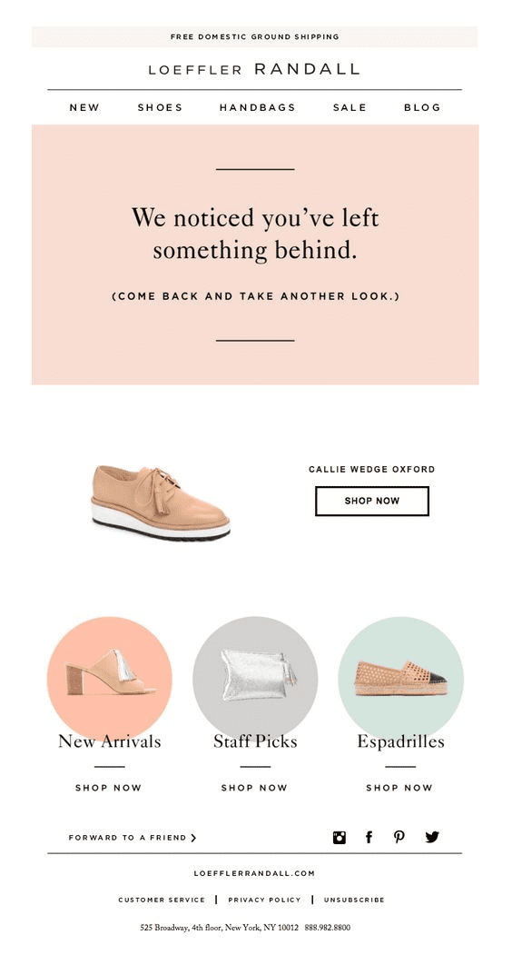
Because they target customers right when they show an intent to purchase, browse abandonment emails are a great example of a well-timed and targeted email strategy.
However, for browse abandoners to receive an email, they will have to be on your email list.
While not every customer browsing products will already be signed up to your email list, you can still collect their email address with the help of popups. This will let you send browse abandonment emails to them as well.
Abandoned cart vs browse abandonment
Browse abandonment emails are very similar to another essential email automation: abandoned cart emails, which can lead to a bit of confusion as to how they differ.
While both are abandonment campaigns, the difference is in how close the customer came to making a purchase.
For abandoned carts, they made it one step further: they actually added something to their cart but just didn’t complete the transaction.
This means that while browse abandonment still signals a high purchase intent, it isn’t quite as high as compared to cart abandonment.
As we’ll discuss later on, this simply means your browse abandonment campaigns should have a slightly lighter touch compared to your abandoned cart emails.
It also means, in SmartrMail at least, if a customer browses your site and adds a product to their cart, they won’t receive a browse abandonment email. Instead, they’ll automatically join your abandoned cart campaign.
How effective are browse abandonment emails?
Seeing as browse abandonment emails are one of the best examples of timely and relevant email automation, it shouldn’t be that surprising that they attract higher engagement from customers.
When compared to regular emails, browse abandonment emails:
- Receive an 80% higher open rate
- Have a 50% higher click-through rate
- And over 10% of customers who click on an email will go on to make a purchase
The goal of browse abandonment emails
If it wasn’t already obvious, that last stat should give you a clear idea of what the ultimate goal of browse abandonment emails is: get customers to come back and make a purchase.
That said, browse abandonment emails don’t have to immediately lead to a sale for them to be worthwhile. There are other goals they achieve as well.
They are also useful at keeping your brand and products front of mind so that when a customer eventually decides to make a purchase, they are more likely to purchase from you. Even if that’s not straight away.
That’s why you don’t need to go in on the hard sell with your browse abandonment emails.
Get Started on your Browse Abandonment Emails with SmartrMail today
? Install SmartrMail and Automate Browse Abandonment series ?
Browse abandonment best practices
Despite how effective browse abandonment emails are, they’re not all created equal.
The above statistics on how they outperform typical promotional emails are just averages. Poorly created browse abandonment campaigns won’t achieve the same results.
On the other hand, by putting effort into your browse abandonment email strategy, you’ll have a good chance at exceeding these benchmarks and making even more sales from them.
So to give you the best shot at setting up a killer browse abandonment strategy, we’ve outlined the best practices to keep in mind below.
- Target the right customers
- Send the right number of emails
- Timing of browse abandonment emails
- Ask customers if they have any questions
- Link people to a shopping cart with the product already added
- Include product recommendations
1) Targeting the right customers
Browse abandonment emails are obviously only going to go to customers who have visited your online store without making a purchase.
But you don’t necessarily need to be sending emails every time a customer doesn’t make a purchase. Instead, you want to be more targeted in who you send browse abandonment emails to.
Only send to those who haven’t purchased yet if they visit multiple times
If a customer hasn’t purchased before, you should only send them a browse abandonment email if they’ve visited your store and not made a purchase multiple times.
This prevents you from sending emails to people who landed on your store without an intent to make a purchase. Once they’ve visited at least a second time, you have a clear purchase intent signal which makes sending them a browse abandonment email worthwhile.
As these people are likely already getting your welcome emails, you also only want to send them one browse abandonment campaign. Limiting yourself to this prevents you from being too pushy early on in the customer relationship.
Existing customers
Seeing as you know existing customers have an interest in your products, you can be a bit more liberal in sending them browse abandonment emails.
For these customers, you can really send them an email whenever they abandon a session on your website. You don’t need to wait until they come back a second time.
2) Sending the right number of emails
It can be easy to think of browse abandonment emails as just a single reminder you send when a customer leaves your store without making a purchase.
But like most automated email campaigns, the best strategies employ the use of multiple emails. Just like how we recommend you automate three different abandoned cart emails.
That said, browse abandonment campaigns are simpler in that they only need two emails.
(Remember that cart abandonment signals a stronger purchase intent than browse abandonment so you shouldn’t be as aggressive with your browse abandonment strategy.)
So what should these two emails look like?
Sign-up to our newsletter and receive a 30% discount on your first 6 months with SmartrMail
The first email
Because you typically want to keep a light touch with your browse abandonment campaign, you don’t need to go into a hard sell with your first email.
So with your first email, you don’t even need to necessarily make it clear to your potential customer that you know they were browsing your store.
Instead, you could simply send them information about the products they were looking at to nudge them further along to making a purchase. Almost like a product education style email.
Another strategy is just to encourage them to make a purchase still without explicitly mentioning that you know they were viewing products. The browse abandonment email below from Smartwool is a good example of this in action.
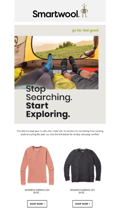
Here Smartwool has simply included products from the same product category that the potential customer was looking at and added a few reasons why they should buy one of the products.
Most emails however will make it clear that they’re browse abandonment campaigns (they don’t try to come across as a regular, albeit well-timed, email).
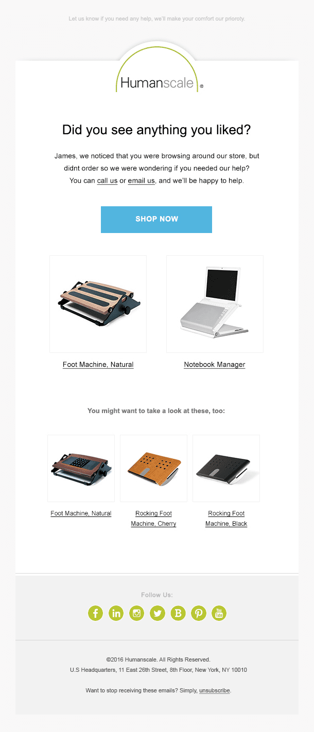
However, these will still only use a light-touch. Often simply asking if the customer has any questions or needs any help making a decision. Like in the example below from Humanscale.
The second email
If the first email doesn’t get the customer to come back and make a purchase, you can send a second follow-up email to help improve your conversion rate.
In this email, you can be a bit more direct with wanting your customer to come back and make a purchase.
Typically you’ll do this by including the specific product(s) they viewed and include a call-to-action (CTA) button linking them to a cart containing the product(s).
The email below from Timberland is a good example of this in practice.

Of course, you should only send this second email when the first one didn’t result in a sale.
If you set your browse abandonment emails up in SmartrMail, we’ll automatically ensure that customers who convert from your first email don’t receive the second follow-up.
3) Timing of browse abandonment emails
So now that you have an idea of what to include in your two browse abandonment emails, you now just need to know when to send them.
As browse abandonment emails tend to get less effective the longer you wait to send them after someone leaves your store, you’ll want to send the first one fairly quickly.
Ideally, we recommend sending your first browse abandonment email within the first couple of hours after someone viewing products leaves without making a purchase.
We then recommend waiting a day until you send your second browse abandonment email. This will give your customer enough time to see and, hopefully, open and respond to your first email.
4) Ask customers if they have any questions
One of the reasons customers leave your store without making a purchase is that there is something they’re unsure about that’s holding them back.
This can be particularly relevant if you send more specialized or complicated products that require customers to research the options before they make a purchase.
Danner does a good job of including a “contact us now” call-to-action at the bottom of their browse abandonment campaign.
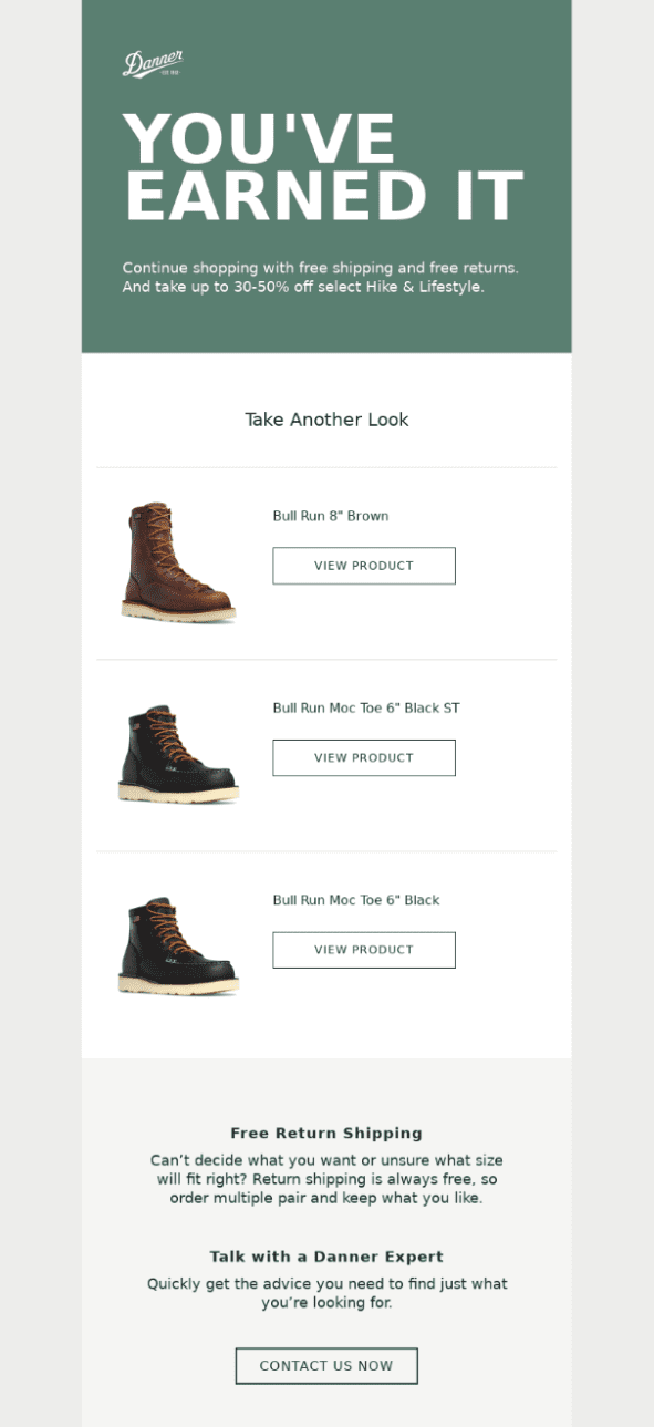
In the first email of your browse abandonment campaign however, you’ll want to consider moving this up toward the top of your email so that it’s more obvious.
5) Link people to a shopping cart with the product already added
If you are going to include the specific product(s) people viewed in your emails, you’ll want to include a link that directs people to a shopping cart with the product(s) already added.
This makes it easier for them to complete the purchase instead of just linking them to a product page where they have to manually add the product to their cart and go to check out. Or worse, if you just link them to your store’s homepage and they have to find the product all over again.
The easier you make it to complete the transaction, the greater your conversion rate will be.
6) Include product recommendations
Another reason why customers may have not made a purchase despite showing interest in a particular product is simply because that product didn’t suit their needs.
Or maybe they were comparing prices across multiple sites and purchased it somewhere else.
In either case, sending a browse abandonment email enticing them to purchase that specific product isn’t going to perform that well.
That’s why you should include similar product recommendations, especially in your second follow-up email.
That way you can still potentially make a sale to these browse abandoners despite them no longer being interested in the original product they viewed.
The browse abandonment campaign below from Converse makes good use of product recommendations.

You can easily add these product recommendations to your browse abandonment email in SmartrMail with our recommended product block option.
This will automatically generate recommendations specific to your customer based on their purchase and browsing history. So there’s no need to worry about coming up with the recommendations yourself every time someone leaves your store without purchasing.
Keep email marketing best practices in mind
We’ve now pretty much covered all of the best practice advice specific to browse abandonment emails. But to ensure your campaigns perform the best they can, it’s important to keep the fundamentals of email marketing in mind as well.
So when creating your browse abandonment emails, make sure you:
Include a clear call-to-action
Whether it’s a link directing people to a product page or a link they can use to get in touch with you if they have a question, you should always have a prominent call-to-action button in your email design.
Not only does this make it clear to your potential customers what action they should take next, it also makes it easier for them to perform the action.
If you don’t include one, the effort of leaving their inbox, opening a new tab, and typing in your store’s address is enough to seriously damage your conversion rate.
Keep your email simple
The old saying that less is more is definitely true with email marketing. And your browse abandonment emails are no exception.
Don’t try to cram too much into your email. Decide what you want your browse abandonment email to say and what action you want your customers to take and make your email focused around that.
Don’t include dozens of product recommendations or a list of every product they viewed. Also don’t include too many call-to-actions (two at the most).
For design inspiration, check out our list of browse abandonment email examples here.
Give your emails an enticing subject line
The best-designed browse abandonment email isn’t going to generate many sales if people aren’t opening it.
One of the few tools you have to make your email stand out when someone goes to open their inbox is its subject line. So make sure you put in some effort when deciding on your subject line.
To help with this, we’ve put together a list of 100 great browse abandonment subject lines for inspiration.

How to set up browse abandonment emails
Now that you know everything you need to know about browse abandonment emails, the only thing left is to set them up.
The good news is that setting up browse abandonment emails is incredibly quick and easy with SmartrMail’s pre-existing templates you can customize. You can find step-by-step instructions on how to do this here.
If you aren’t already using SmartrMail, you can sign up for a 15-day free trial here.
Wrapping up
Browse abandonment emails are a great and easy way to generate additional sales for your store.
They send at the perfect moment right when customers show high purchase intent and are personalized with content tailored to them.
When setting them up, you just need to keep the best practices we’ve covered in mind. And once you set them live, they’ll start generating sales for you automatically with no ongoing effort required.
So there’s no reason not to start creating your browse abandonment emails right now!

