Below are some of our favourite Cyber Monday Email Examples. With Cyber Monday hitting a record $7.9B in sales last year up 19.3%, it’s no longer Black Friday’s overlooked younger sibling. Having a dedicated Cyber Monday marketing strategy is a must, with more shoppers choosing online shopping over in-store sales this Black Friday Cyber Monday weekend.
We hope you already have your Black Friday Email Templates ready, but now it’s time to turn your attention to Cyber Monday. Whether your online store is running the same sale over the entire week or you’re doing a separate Cyber Monday sale, we hope you’ll find some email design inspiration for one of the biggest shopping days of the year.
Cyber Monday Email Examples
1) Herschel Supply Co. Cyber Monday Email

Herschel Supply Co. keeps the Black Friday theme with an all black template. Their email clearly states the offers and has a single call to action making it easy for subscribers to start shopping on their site.
However for each order value tranche, they choose to offer a different discount code. It would be a better experience for shoppers if Herschel chose instead to have a single discount code that would auto apply the offer based on the cart value.
2) GFDA Cyber Monday Email
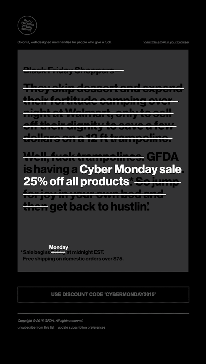
After crafting half a dozen or more Black Friday emails you’re likely feeling pretty lazy when it comes to preparing more email marketing campaigns for Cyber Monday.
GDFA does a playful take on this lazy feeling by striking out their Black Friday email design and adding their Cyber Monday sale on top. The email design is simple but witty and has a clear offer that’s easy to understand.
One small change that GDFA could have made would be to make their call to action and discount code a bit stronger as it gets lost behind the black overlay.
Get Started on your Cyber Monday Emails with SmartrMail today
? Install SmartrMail and Automate your Cyber Monday Email series ?
3) P.F. Candle Co. Cyber Monday Email
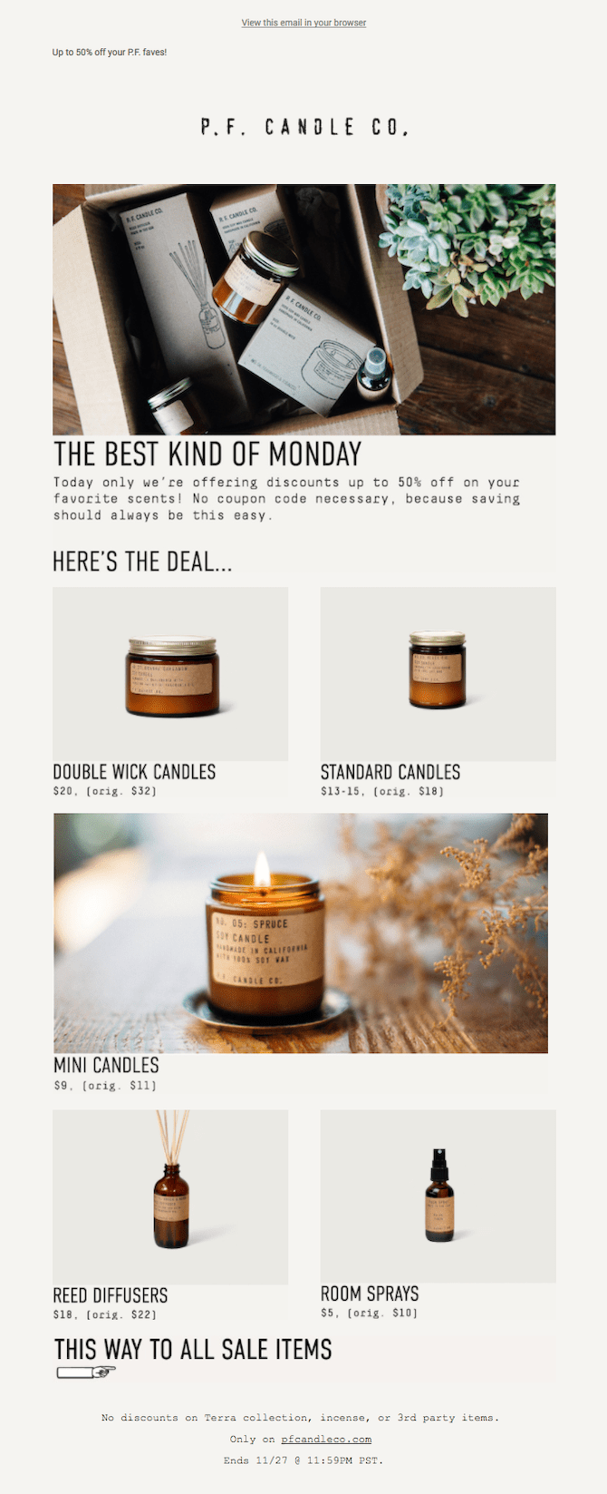
If you have beautifully designed products you should take every opportunity to showcase them in your emails.
That’s exactly what P.F Candle Co do with their image heavy email. With their product images looking very similar, they do a great job of implementing in a couple in situ photos to break up the email and make the design more exciting.
Rather than use a discount code, they’ve also chosen to apply the discounts directly to all their products. If you can’t give a flat discount across all your products this is a great strategy to get involved in Cyber Monday without having to lose out on margins.
One thing we’d improve on this email is the lack of a bold call to action. While the arm at the bottom is well designed, swapping it out for a button is likely to make it easier for shoppers.
4) Tanner Goods Cyber Monday Email
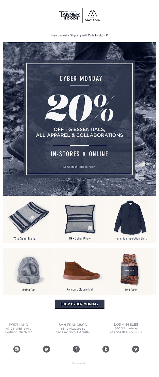
Clear offer, popular products, bold imagery – Tanner Goods checks all the boxes with their Cyber Monday email campaign.
While featuring products in your sale emails tends to distract from the offer if everything is on sale, having your popular products when you’re only putting select collections on sale is a good idea. Remember to keep the products limited to 6 items and in different collections if possible. You want shoppers shopping on your site without distractions rather than in their inbox.
5) Everlane Anti Cyber Monday Email

Not every brand can offer Cyber Monday deals, either your margins are too small or you don’t want customers holding out on purchases until your next sale. That’s okay – but you shouldn’t stay silent during Cyber Monday. Your customers expect to hear from you and they have money to spend.
Everlane do a great job by restating the value they offer all year long. However if discounts aren’t an option, you should consider alternatives for your store. Options include free shipping, including a free gift for orders over a certain threshold, or limiting the sale to VIP customers.
One thing Everlane could do better is to segment their campaign by gender. This would significantly reduce the number of call to action buttons, and also keep the products and imagery targeted. With marketers finding that implementing segmented email campaigns can result in an increase of 760% in revenue – it’s a no brainer to segment your email list!
Sign-up to our newsletter and receive a free Calendar with all the most important key eCommerce dates that you shouldn’t miss in 2024
6) Dr. Martens Cyber Monday Email
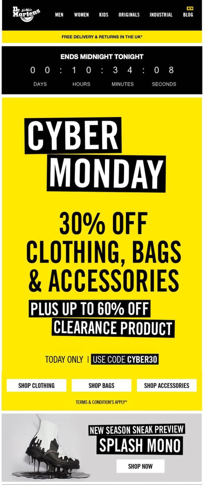
Almost every Black Friday Cyber Monday email will be black and white. Dr. Martens breaks the mold and uses a bold yellow to have their email campaign stand out in inboxes. It has a clear offer, limited call to actions, and visible discount code. The use of a countdown timer also creates a sense of urgency.
They could probably avoid the sneak preview section at the end of the email, but the rest of the email is so good that we’ll let this one slip!
Next Steps
Now that your Black Friday email is out of the way, it’s time to take inspiration from these email examples and nail Cyber Monday!
Once you have your email ready, you’ll need a great Cyber Monday subject line to ensure that it gets opened and read.
If your Black Friday email isn’t ready yet, you can also check out our list of Black Friday email examples to help generate some ideas. We also have a list of Black Friday subject lines for when you have the email ready to go.


