Everything You Need to Know About Email Popups
July 6, 2021
If you’ve spent even a small amount of time browsing the internet, you’ll have come across email popups.
They’re one of the most common experiences you’ll encounter on the web.
And for good reason too. Study after study consistently shows that popups improve conversion rates and lead to more sales.
But despite this, many merchants still haven’t started running a popup on their online store.
So in this article, we’ll take you through everything you need to know about popups including design best practices, how to optimize the user experience and some things you’ll want to avoid.
What exactly is an email popup?
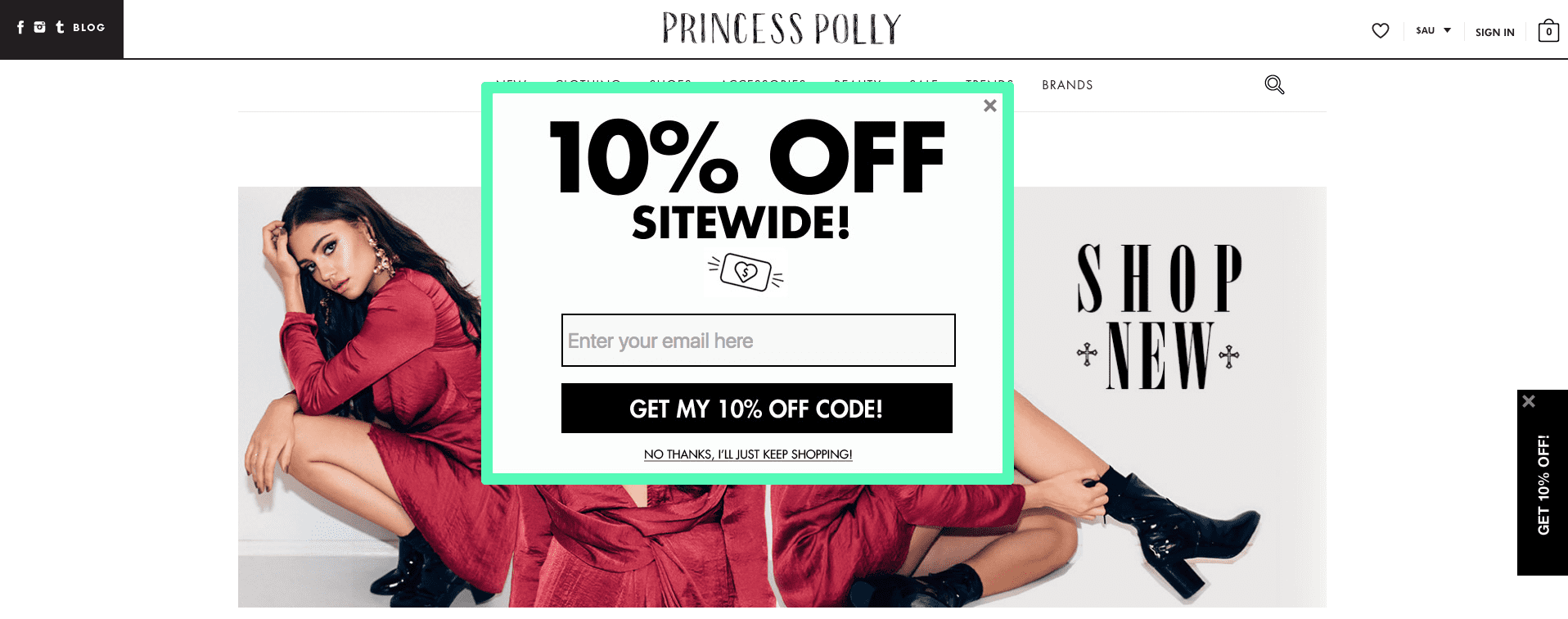
Generally when people refer to a popup they’re referring to a small window or frame that appears on top of a website, often darkening the page behind it. Like in the example below.

However in this article we’ll use the term popup to also refer to other full-screen popups that completely cover the webpage as well as smaller bars that appear either at the top or bottom of the page. Like in the example below.

Not just emails
The other important point to keep in mind is that popups aren’t just for collecting email addresses.
Although that may be their most common use case, especially when we’re talking about email popups, they can also serve other purposes.
For example, because they’re so attention-grabbing, they make for a great way to let your website visitors know about any sale or special promotion you’re running.
Can also collect phone numbers and other details
In addition to email addresses, you can also use popups to capture other information to use in your marketing.
One example of this is also collecting customer’s phone numbers for later use with your SMS marketing. Another example is asking customers for their birthday so you can send them an email on their birthday. Just like in the example below.


Why it’s important to set up popups
As a merchant, you likely spend a decent amount of time and money driving potential customers to your online store.
But, as you’d be well aware, getting visitors to visit your store is only half the challenge. The second, arguably more challenging half, is getting them to make a purchase.
Unfortunately, most customers don’t convert on their first visit. Instead, they will make multiple visits before they make a purchase.
The good news is that popups, when used well, not only increase the likelihood of a customer converting on their first visit but also when a customer fills out your popup form, gives you a way to remarket to them later on.
They’re also a great way to grow your email list.
Why it’s important to have a dedicated mobile popup
When talking about customers visiting your online store and not converting, it’s important to remember that half your customers are visiting your store from a mobile device.
And these customers are actually less likely to make a purchase and are more likely to never come back to your store.
So it’s especially important to ensure you’re running popups to these customers and that your popups look great on mobile devices.
Which is why you’ll want a dedicated mobile popup instead of just duplicating your desktop popup so you can have more control over how it’ll appear.
Popup best practices
So now that you have a clear understanding of what popups are and why they’re important, it’s time to look at what the best practices are when it comes to popups.
Design
When it comes to the actual design of your popups, there are a few elements that you should always include and some more that you should at least seriously consider.
The first element you should always include is a way for visitors to easily dismiss the popup.
While it might seem tempting to want to ‘force’ anyone visiting your online store to fill out the popup, doing so will only incredibly annoy potential customers and could potentially lead to penalties from Google which will harm your organic traffic.
That’s why all of SmartrMail’s popup templates come with a simple cross in the upper right corner so people can easily dismiss it.

The other elements you’ll definitely want to include in your popup’s design are an engaging headline and a clear call to action.
Exactly what your call to action is will depend on exactly what you want your popup to achieve (e.g., collect email addresses, phone numbers, or simply highlight a sale offer).
The more creative you can be with your call to action, the better as well.
Just consider the two popups below.

Both are trying to collect people’s email addresses, but the one on the right is far more compelling than the one on the left.
One thing that could be improved with the popup on the right however is its button text.
“Subscribe Now” is such a generic and overused phrase that it lets the rest of the popup down. Instead, they could’ve gone for something much more engaging and unique and ”Get My Free Sampler!”
Obviously, the more enticing your offer is, the more people you will convert as well.
While a 15% discount coupon will get you more signups than a 5% offer, it’s not always about something of monetary value either. A free guide with relevant content can improve your popup conversion rate as well. It’s all about making sure you offer something of value to your customers.
Lastly, another element you’ll seriously want to consider including is some imagery to attract people’s attention.
While this is not essential, the more attention-grabbing your popup is, the more successful it will be.
If you’re unsure of what images to include, consider the following ideas:
- Images of your products
- People who represent your target audience or ideal customer
- Showing your products being used
For more tips, check out our guide on popup design here.
Timing
Many merchants hold off on running popups on their stores because they’re concerned about annoying their customers.
The truth is, however, that popups don’t have to be annoying if you set them up the right way. And a big part of this is getting your popup timing right.
You don’t want your popup to display straight away when someone first lands on your store. Instead, it’s better if you wait at least ten seconds before showing your popup.
An even better way to make your popups less intrusive is to optimize your trigger conditions.
Triggers
Trigger conditions refer to what causes your popup to show for a particular visitor. And you don’t want to trigger your popup every time a customer visits your store.
To make your popups less intrusive, it’s better to wait until your visitor has visited at least a couple of pages before showing your popup.
Another good option is to give your popups an exit-intent trigger. This will mean that your popups will only display when someone goes to leave your store.
Exit-intent popups are a great way of not interrupting your customer’s experience and gives you a second chance of engaging with someone just as they were about to leave your store.
Lastly, another option is to only have a popup trigger on a particular page.
Doing this lets you set up multiple specific popups that are targeted to what content your visitors are browsing.
For example, say you’re running a Shopify jewelry store and you sell a range of jewelry including wedding rings. You could set up a popup that offers visitors a free guide to choosing the best wedding ring that only triggers on wedding ring product pages.

How to set up email popups in SmartrMail
Now that you have an idea of what popups are, why they’re important, and what goes into good ones, the only thing left is to start setting them up.
Thankfully SmartrMail makes it incredibly easy to create your own popups with our pre-made templates and you can customize with our drop and drag designer.
Better yet, our popup is completely free to use and has no limits on how many email addresses, phone numbers, or other details you can collect with it.
To see how you can create your own popups in SmartrMail, check out our walkthrough video below.
Conclusion
Popups are an incredibly effective and easy way to make the most of the opportunity potential customers visiting your store represents.
And when set up according to the best practices we’ve gone through in this article, they won’t annoy your customers. If anything, they’ll improve your customer experience by offering relevant content.
So now that you know what goes into a well-designed popup, it’s time to start creating your own.
If you’re still looking for some more inspiration however, we’ve also got a collection of great email popup examples here you should check out.