Continue reading for some of our favourite examples of Effective Popups For E-commerce Stores. An effective email popup can get your fashion store valuable leads, build your social following, and get you more sales. However many stores overlook important marketing elements, resulting in annoying to mildly insulting popup messages.
The best fashion marketers use popups that have a meaningful offer, a clear call to action, and imagery as stylish as their store. To get you started, we’ve provided 8 examples of highly effective popups from the most successful fashion brands.
1. Kate Spade
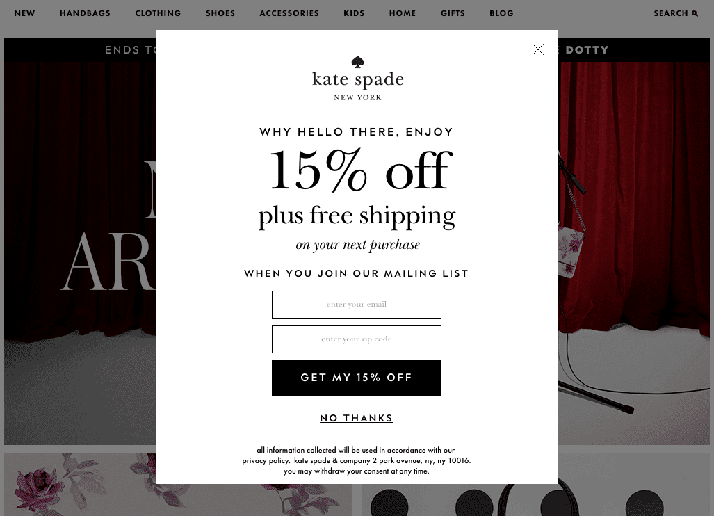
What we like:
Kate Spade offers a meaningful discount plus free shipping in exchange for an email address. The popup isn’t too busy and the vertical rectangle allows them to add spacing to their copy.
2. Pull & Bear
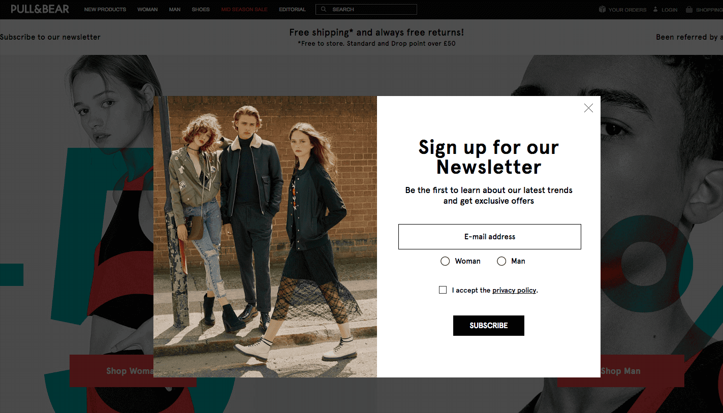
What we like:
Pull & Bear segments their newsletter subscribers right at sign up. As a young man, this ensures that I won’t be receiving the latest floral dresses in my inbox.
Read: 5 Reasons why building your email list is a major key to e-commerce sales growth
3. Ben Sherman
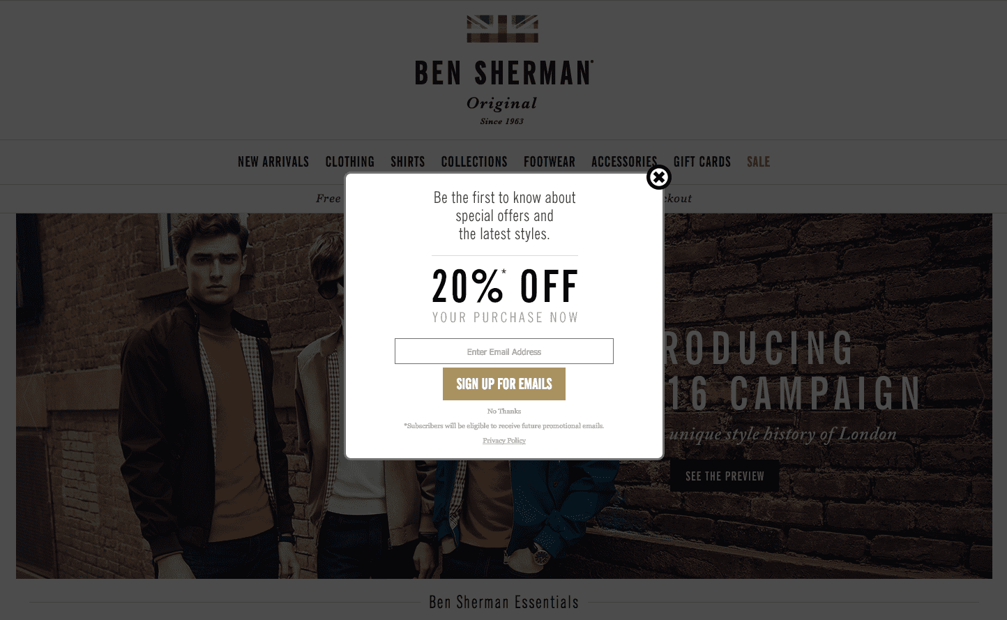
What we like:
Ben Sherman‘s popup is as clean and sophisticated as their brand. They choose a clean font and keep their Popups For E-commerce simple with a bold discount offer and a single call to action.

Create Popups For E-commerce stores with SmartrMail todaty
? Install SmartrMail and use our popup templates ?
4. Princess Polly
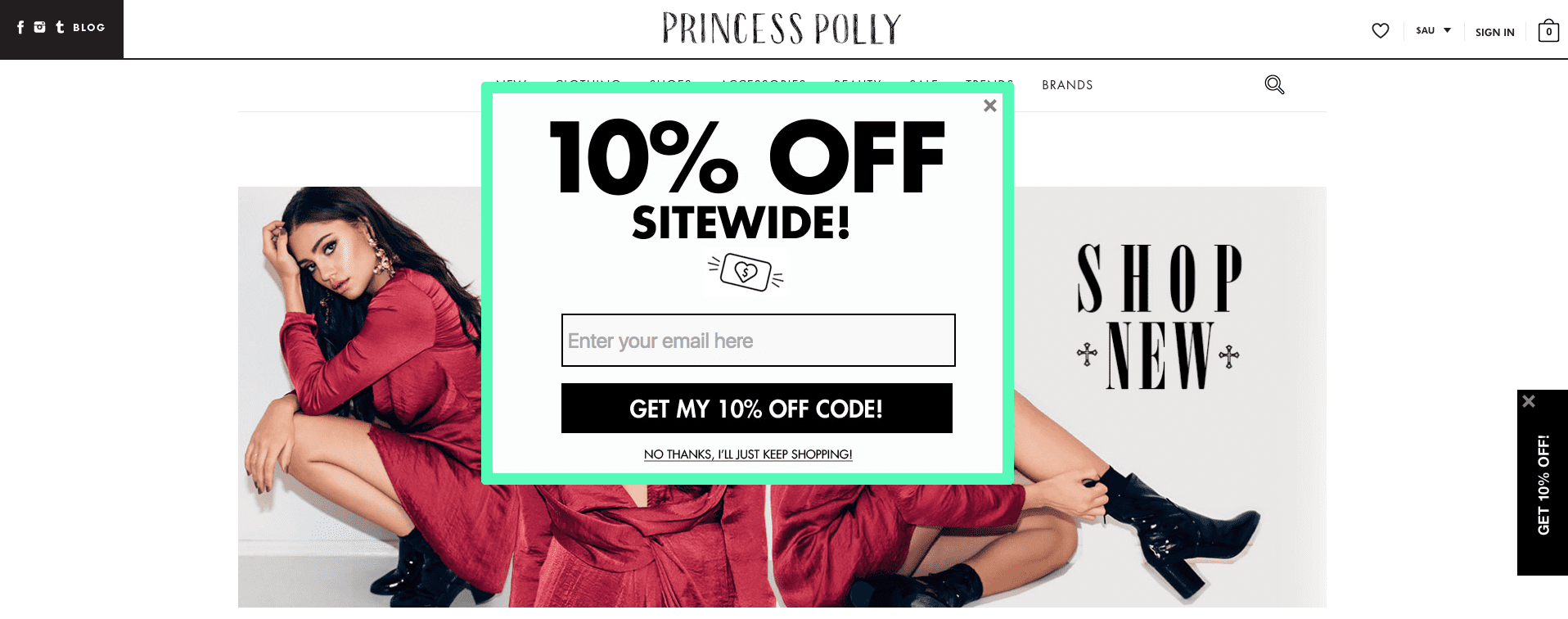
What we like:
If your brand is loud and proud, your popup should follow suit. Princess Polly is the perfect example with a bold font and neon green border. The addition of the 10% OFF tab on the far right is handy if your customer decides they want the discount once they find a product they like.
Get started with SmartrMail’s free email collection popup.
5. Betabrand
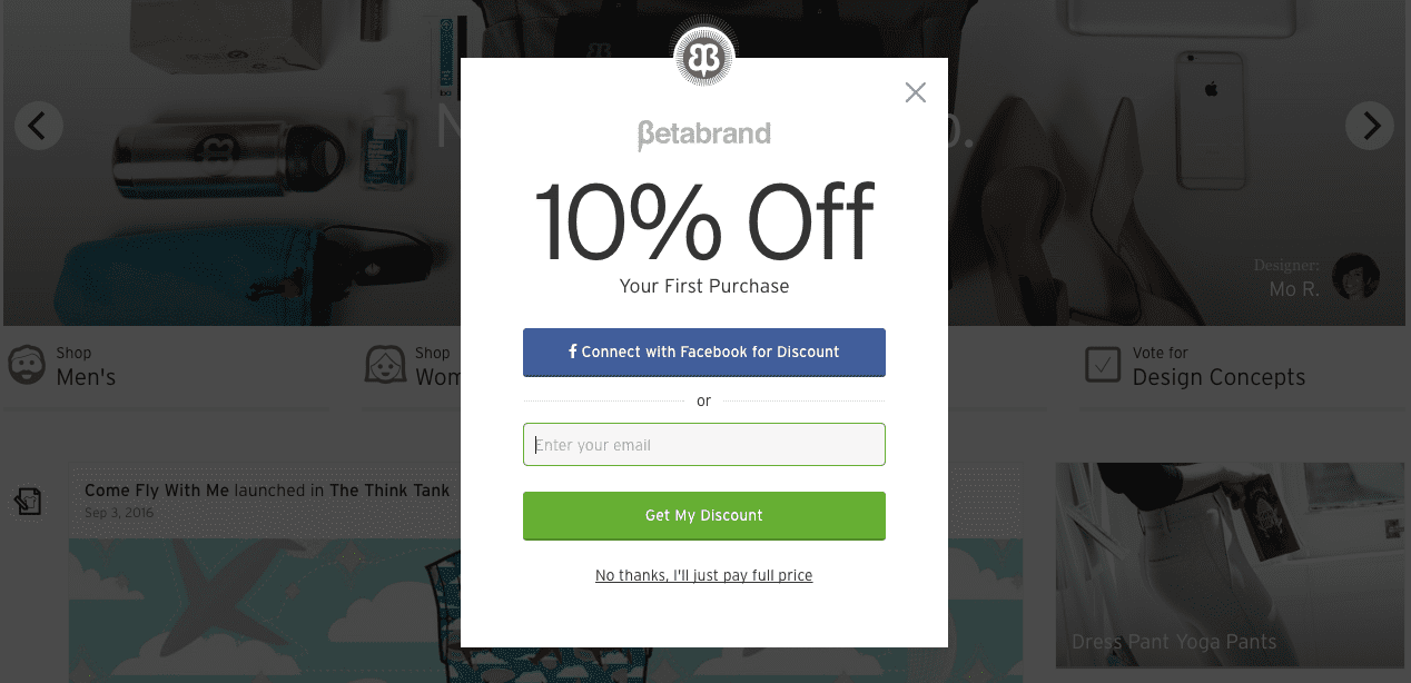
What we like:
Not all ecommerce fashion marketing is done on email, and fashion stores should focus their marketing efforts on the channels that generate the highest return. With over 300,000 Facebook followers, Betabrand gets sales through harnessing the power of community and social media. We like how their popup gives customers the choice to join their Facebook community or subscribe to their newsletter.
Read: 4 Ways to Optimize Your Facebook Business Page For Ecommerce Sales
6. Goorin Bros.
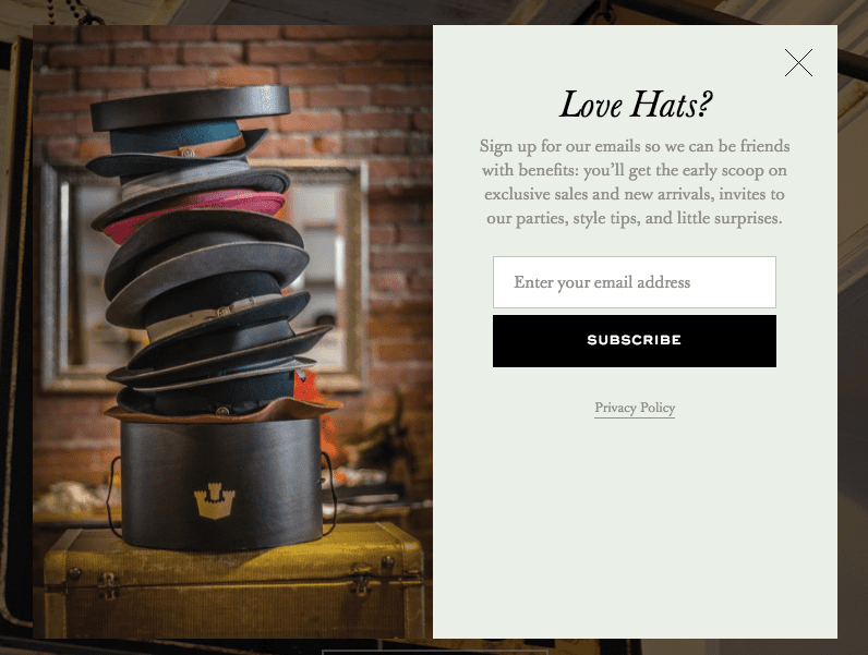
What we like:
Goorin Bros. has a creative image and witty copy in their email popup. If you don’t want want to subscribe to the newsletter you can click “X” instead of clicking a passive aggressive “I don’t love hats”.
7. Forever 21
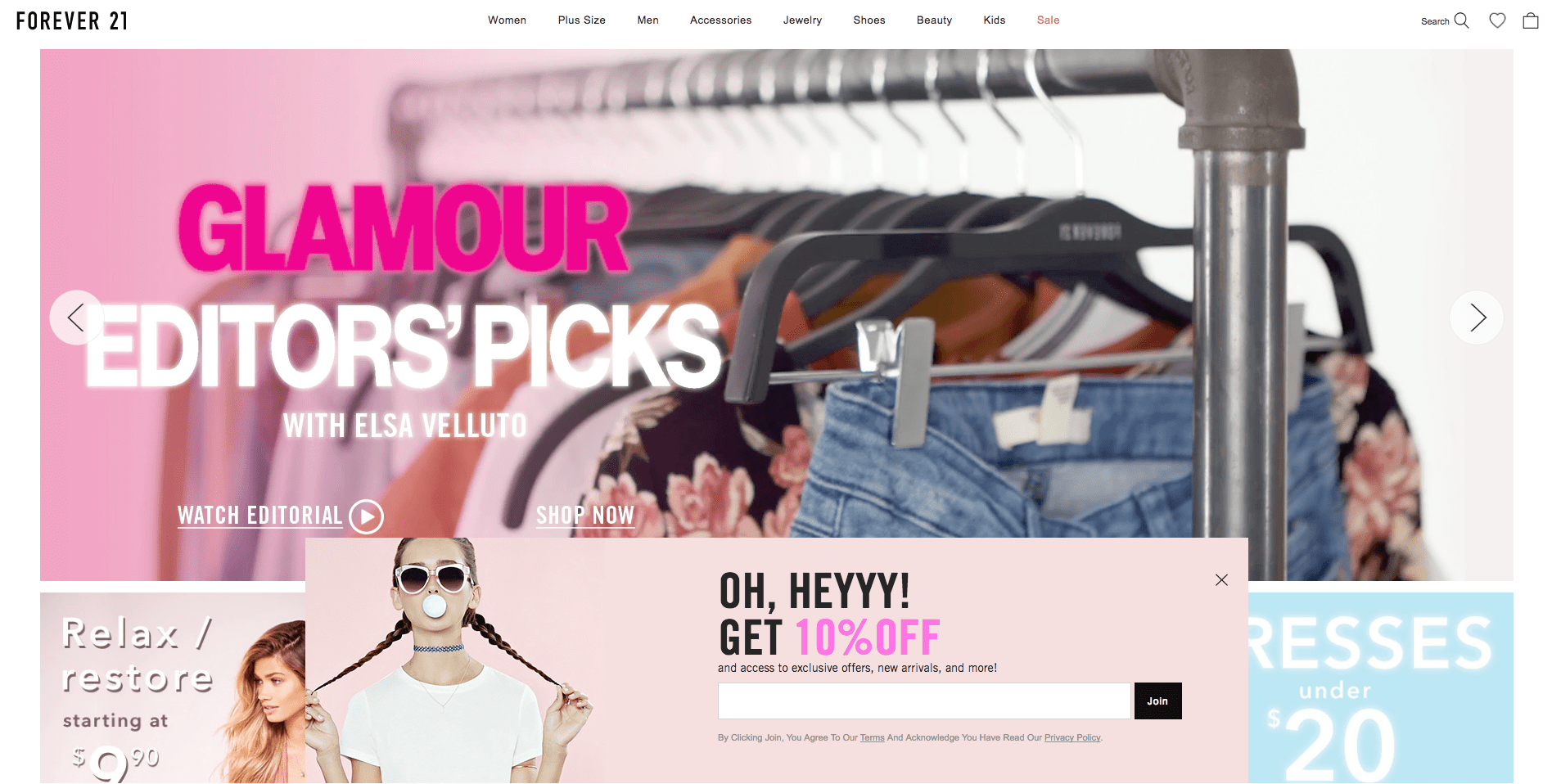
What we like:
Forever21‘s popup color scheme perfectly matches their brand. The trendy image and bold font stands out from the soft pink. Their discount offer is highlighted and the positioning doesn’t interrupt the customer’s shopping experience.

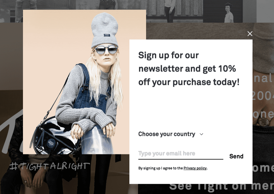
8. Cheap Monday
What we like:
Cheap Monday breaks the mould of the traditional rectangle pop up. Their image and design is trendy and on brand, and their discount offer is clear.
Our friends over at BigCommerce have gone deep on pop up design for ecommerce in an interesting post here if you want to read deeper.
Popups For E-commerce are a powerful way to increase your current active subscribers. Ready to start building your email list and growing your ecommerce store now? We offer a forever free SmartrMail popup for Shopify and BigCommerce stores. While you’re at it try out our automated product emails, abandoned cart emails, and quicker email newsletters – free for 15 days.
