Lets dive into How to Write a Converting Discount Offer Email. If you’re an ecommerce marketer, then chances are you’re already using email marketing to drive sales. After all, email is the most effective marketing channel, surpassing the likes of social media and display ads.
But don’t be fooled into thinking that this makes getting sales from email easy. As you have probably already realized, there is a big difference between just sending an email blast to your subscribers and actually writing an email that converts.
How often have you been in the situation where you’ve got a fantastic special offer you want your email list to know about, only for very few of them to take it up? Being in this kind of situation is disheartening, but don’t let that dissuade you from email campaigns in the future.
Knowing what the ingredients for a high converting email are and implementing these in your next email marketing campaign will make all the difference.
We say ingredients because there’s no one factor that will ultimately determine whether the email you send will convert people or not. Rather this relies on numerous factors.
In this guide we’ll take you through all the things you need to be aware of in order to write a discount email that converts.
Target the Right Recipients
Who you send your email to has a huge effect on the your conversion rate.
Assuming you already have a healthy email list (if not, you can find strategies to build your email list here), you might be tempted to send your email to everyone on your list. This is usually not a good idea.
Over 78% of people will only engage with offers if the email has been personalized to their needs.
This means that you simply cannot send the same offer to everyone on your list. Subscribers who have never shown an interest in activewear and instead only buy jeans are not going to be converted by email offering a discount on yoga pants.
Take the Father’s Day email below as an example.
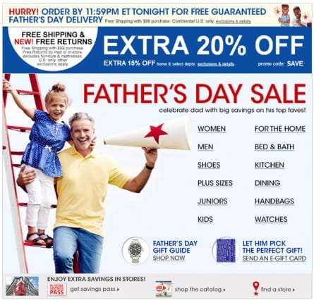
This email was likely sent to let people know of the brand’s Father’s Day offer. The targeting of such an email should be straightforward: target people looking to buy presents for their fathers. Despite this, the email includes links for ‘Women’ and ‘Handbags’.
While we have no way of telling who the email was actually sent to, the uncategorized nature of it and the lack of targeting within the email itself harms its conversion potential.
Only send your offer to people who are actually likely to be interested in it.
Write an Engaging Subject Line
Once you have selected the right recipients for your offer, you need to start thinking about the email itself.
Your subject line is the first impression people will have of your email.
This will determine whether people open your emails or not. In fact, over a third of people will base this decision on the subject line alone. It doesn’t matter how good your offer is, nobody is going to convert if they don’t even read your email.
So how do you write an email subject line that will lift your open rate?
When it comes to discount offer emails, you will want to ensure that the offer is included in the subject line. So if you’re offering free shipping, make sure those two words appear in your subject line.
Beyond this, follow best practices such as keeping it short and simple, not sounding too spammy, and ensuring that your wording highlights the benefit to subscribers so that they have a reason to open your email.
For more practical examples of what constitutes a good subject line, we have a post on how not to write your subject lines so you don’t make the same mistakes as others have.
Design an Email People Will Want to Read
After your subscribers have decided to open your email, the next thing they’ll notice is your design. Although this is less of a hurdle than with your subject line having to getting people to open your email, a bad design can still cause your subscribers to stop reading your email. A good design, on the other hand, will encourage your recipients to keep reading.
To create a sense of familiarity, it’s good to make your emails look as much like your website as possible. You should also include your logo in your header to maintain brand consistency, along with using the same fonts and colors in your email.
For ecommerce stores selling physical products, including high quality images is a must. Just take the email from Tommy Hilfiger below as an example.
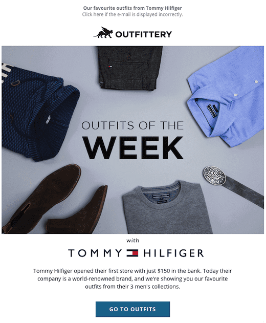
This email includes high quality images of the products they’re trying to sell. Not only does this give their subscribers a better sense of what the products they’re potentially going to buy are, but also greatly adds to the overall design and professionalism of the email.
As Tommy Hilfiger is an apparel brand, it’s also a good idea to include images of models wearing their clothes. This is exactly what they’ve done further down.
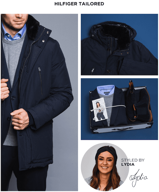
This makes for a highly effective email from Tommy Hilfiger, something that becomes even more apparent when you compare it to the email below.
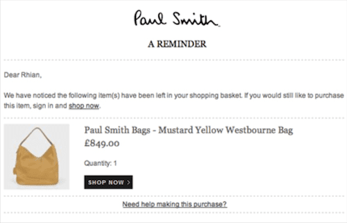
While this email is not a promotional email per se (an abandoned cart email instead), it’s imagery still leaves a lot to be desired. The image of the product is too small to make out any details and certainly doesn’t add to the overall design aesthetic. Granted, this is not as important for abandoned cart emails, but for a promotion email, you will need better images.
Beyond images, other major design tips to follow include making sure your emails display well on mobiles and making sure your text in actually readable with the color and font combinations you chose. We have other articles on design tips for email newsletters and designing ecommerce promotional emails that you might want to read for further guidance too.
Sign-up to our newsletter and receive a 30% discount on your first 6 months with SmartrMail
Write Compelling Calls to Action
The final job your email has to perform is getting the recipient to engage in the action you desire. For a discount offer email, this will most likely be making a purchase of the product or service on offer. This is where calls-to-action, or CTAs, come in.
Email CTAs will often take the visual form of a button with a label such as “Visit the Website” or “Buy Now”. The reason they will often appear as buttons is to encourage clicks and to stand out visually. Needless to say then that you need to ensure your CTA stands out to people so if they want to take advantage of your offer, they have a clear means to do so.
Limit yourself to just one CTA as well. Having too many will distract users and they might end up not clicking on the one you’d prefer them too. If your email is particularly long (which isn’t generally a good idea as inboxes will clip messages and subscribers will become fatigued) then including multiple copies of the CTA can be alright.
Keeping the copy benefit oriented will also help. Don’t settle on boring “Click Here” or “Download” buttons, instead try something like “Join the Family” or “Stay Connected” that’s more engaging. Compare the two CTAs below to see this difference.

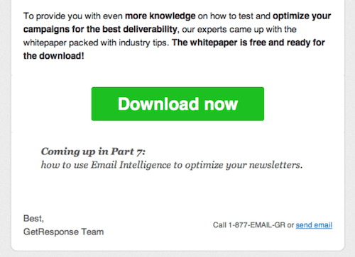
As you can hopefully tell, the “Convert More Visitors” copy is much more engaging than the uninspiring “Download now”.
There’s a lot more theory on what makes a good CTA that is beyond the scope of this blog post. If you’re not confident with your CTAs then it’s well worth diving and learning more about them.
Optimize Your Landing Page
Conversions hardly ever occur within the email itself. Rather they occur on your website when someone actually makes a purchase (or in-store if you’re not in ecommerce). This means that no matter how good your email and offer are, if your website isn’t up to scratch, you aren’t going to get as many conversions.
The landing page your subscribers land on right after they click your CTA should therefore make it super simple for your customers to finalize the transaction. This is why custom landing pages are good for special offers. For limited time offers, you could even include a countdown that creates a sense of urgency.
Point here is to remember that getting conversions is about the customer journey. While email plays a major role, you can’t think of it in isolation. Now that you’re aware of this and know how to write a converting discount email, it’s time to put this knowledge into practice!
Read summarized version with

