So you’ve just made a sale on your ecommerce store – congratulations!
Now that you have your customer’s money, you might be tempted to think that all that’s left is to ship the product and make sure your new customer receives it. That you no longer have to worry about marketing.
The truth however is that from the moment your customer has made the payment, how you interact with them as a brand will have a significant impact on their impression of your brand.
And what is the first point of contact a customer has with a brand after making a purchase? Well the first thing most people, myself included, will do is immediately check our email inboxes for an order confirmation email.
These order notifications allow us to ensure that the store has received our order and payment successfully and that our new purchase is on its way.
While these reasons for opening and reading this email are purely practical (making sure no issues occurred), that doesn’t mean you should confine your store to sending uninspiring and simply functional email notifications. Instead order confirmation emails present an opportunity for smart email marketers to reinforce their store’s branding and impress their new customers.
So you can see exactly how much of an invaluable opportunity these emails are for lead generation, we’ve compiled a list of some of our favorites. Here we’ll go through what we think makes them such good examples.
Gets You Excited For Your Order
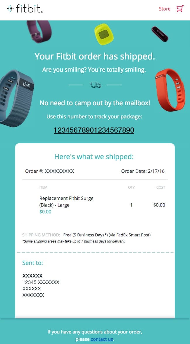
Fitbit is an example of a great consumer brand that does marketing well. And their order confirmation email doesn’t disappoint.
Not only is it well designed, but the line “Are you smiling? You’re totally smiling.” is sure to put a smile on the reader’s face. This gets you excited for your new fitness tracker and reinforces Fitbit’s brand positioning as fun and youthful. The next line, “No need to camp out by the mailbox” further reinforces this.
On top of that, the email delivers everything someone searching for their order confirmation is looking for. Order number and details, estimated delivery time, tracking link, delivery address, it’s all there.
Incentivizes Further Shopping
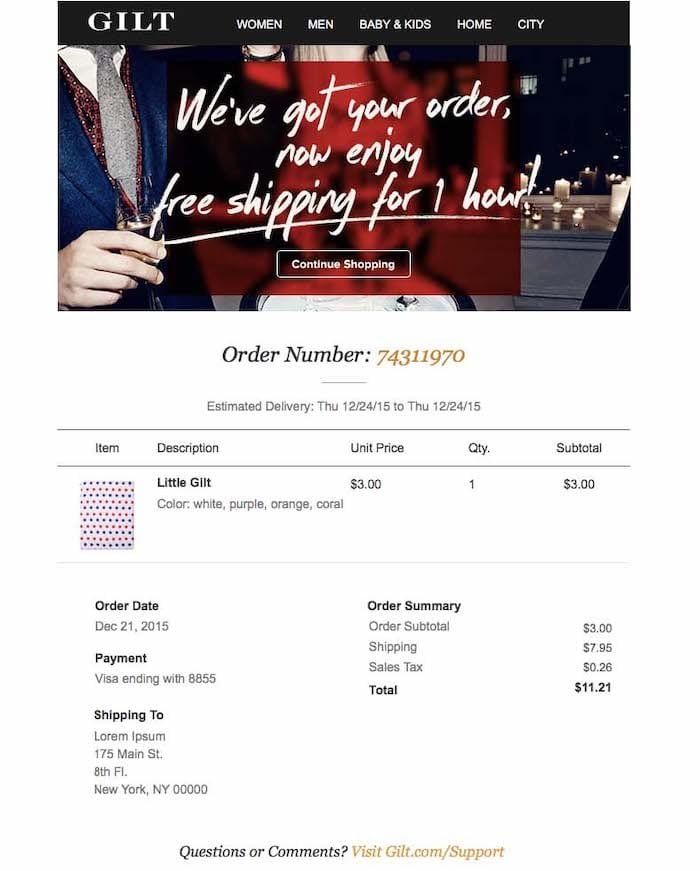
Gilt doesn’t waste any time trying to get more sales from people. Within seconds of someone making a purchase they’re already including a free shipping offer in their order confirmation email.
When you think about it, this makes sense. Gilt is sending an email is a super targeted group of people who they know are willing to make a purchase with them online. This almost certainly will boost their conversion rates for this campaign.
What’s more, by limiting it to just one hour, they can easily ship the additional purchases with the original purchase. As the customer has already paid shipping for their first order, this limits the cost of the offer to Gilt.
If you already offer free shipping, or don’t want to include it as an offer, you can always include an incentive in your order confirmation email. Being such a prime opportunity, you’ll want to take advantage of it in one way or another.
Automate your email flows with SmartrMail today
? Install SmartrMail and try all our features in your free trial ?
Up-Sell & Cross-Sell Products
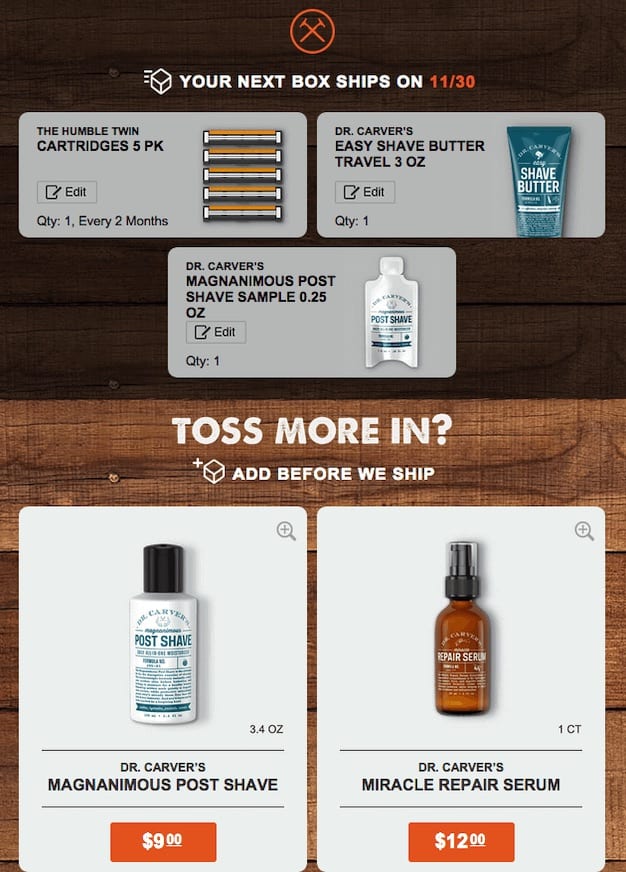
As order confirmation emails are such a golden opportunity for making more sales (they have an open rate approximately 8 times that of regular emails) why not take the chance to upsell?
Dollar Shave Club does just this in their confirmation emails.
These are simply products related to what the customer has purchased included beneath all of the order details. Being related products, there’s a fair chance that your customer will want these products too and will add them to their cart.
If you want to go a step above, instead of manually choosing which products get recommended with which purchase, you can automate this process.
Automatic product recommendations are a great way to increase sales this way with minimal effort on your end. These recommendations typically use machine learning to analyze a customer’s purchase history and compare it against other customers’ purchases to determine what to recommend.
Feel Good Order Confirmation Emails
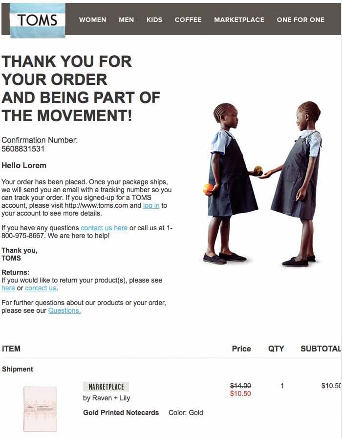
If promotional offers don’t fit your brand, then perhaps following the lead of Toms and adding something a bit more meaningful might be the way to go.
Toms charitable work is well known and a quintessential part of their brand. It’s also something they remind you of in their order confirmation email. This is not just to reinforce their branding, but also to make you feel good about your purchase.
Buyer’s remorse is all too real and something that marketers have to deal with. Getting someone to feel that they’re doing good is a great way to limit post purchase regret among your customers.
This will leave your customers feeling satisfied with their purchase before their items have even arrived.
Makes Shipment Tracking Easy
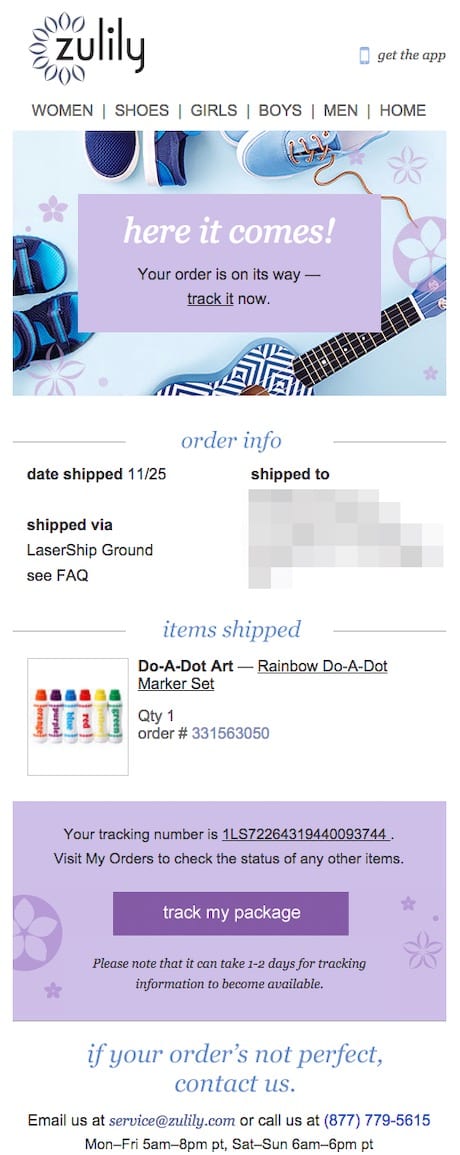
You should always include shipping information in your order confirmation emails.
After making sure their order and payment was successful, the next thing people are going to look for in an order confirmation email is a way to track their shipment. Many people will then also refer back to the email later on as a way to access tracking details to see how far away their new items are.
Making it easy to track someone’s package within your email is therefore something you should aim for in your design.
This email from Zulily does a good job of this with their clear ‘track my package’ call to action button.
By providing a clear pathway to checking where their package is, the email spares their customers the need to copy and paste tracking or order confirmation code and loading up a website in a new tab. Instead all the customer needs to do is click on a button.
The only thing that could be improved is making the CTA button stand out more by using a more contrasting color or design.
Sign-up to our newsletter and receive a free eBook with hidden Email Marketing Tips
Great Order Confirmation Email Designs
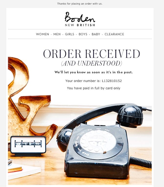
There are some dreadfully bland order confirmation emails out there. The silver lining to that cloud is that this makes it incredibly easy for your emails to stand out from the crowd. All you have to do is put a bit of effort into designing your emails.
Take the email above from Boden. The design certainly grabs people’s attention and stands out in their inboxes. The imagery and typography also perfectly aligns with their brand image as a traditional British clothing line and shop.
The email below from Fat Brain Toys is another great example of good design.
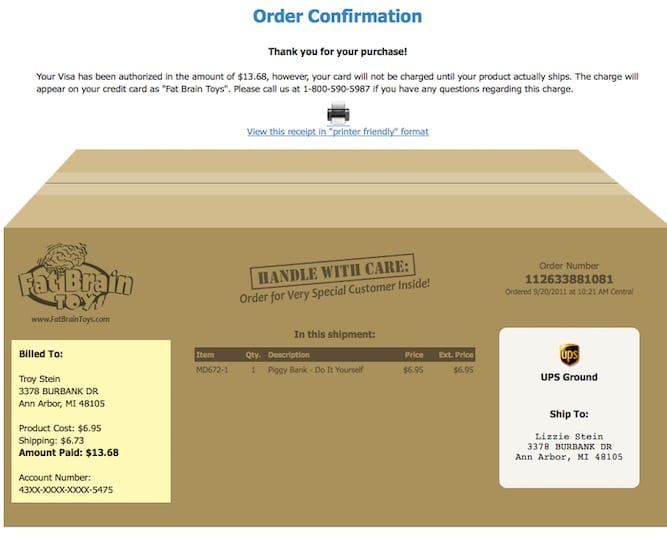
While the imagery and overall appearance of the email isn’t as visually appealing as Boden’s emails, its creativity more than makes up for it. This is especially true for their target market of children and teens.
This makes these some of the best order confirmation emails we’ve seen.
One thing Fat Brain Toy’s email has over the email from Boden is the inclusion of all relevant order details. Always make sure that you include these details. If a customer cannot find them, no design will be able to make up for the frustration as a result of not being able to find the information one is looking for.
The only concern with Fat Brain Toy’s email is that being an image, the details might not be easily readable on mobile. Ensuring your emails are mobile friendly is essential as most email opens now occur on mobile devices.
Taking Advantage of User Generated Content
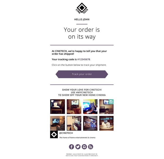
User Generated Content (UGC) is a great marketing strategy for ecommerce stores, especially if you’re selling a particularly Instagrammable product.
Right below their well placed and useful order tracking CTA, Cinetech encourages their customers to show off their new home cinema setup on Instagram.
You might not think of home cinemas as being an overly Instagrammable product, but this order confirmation email shows how encouraging UGC can be a great social media strategy. These posts that customers generate help to create brand awareness as well as provide social proof. Two things that can be immensely beneficial to small businesses as they help alleviate fears people might have about online shopping.
Including an Animation
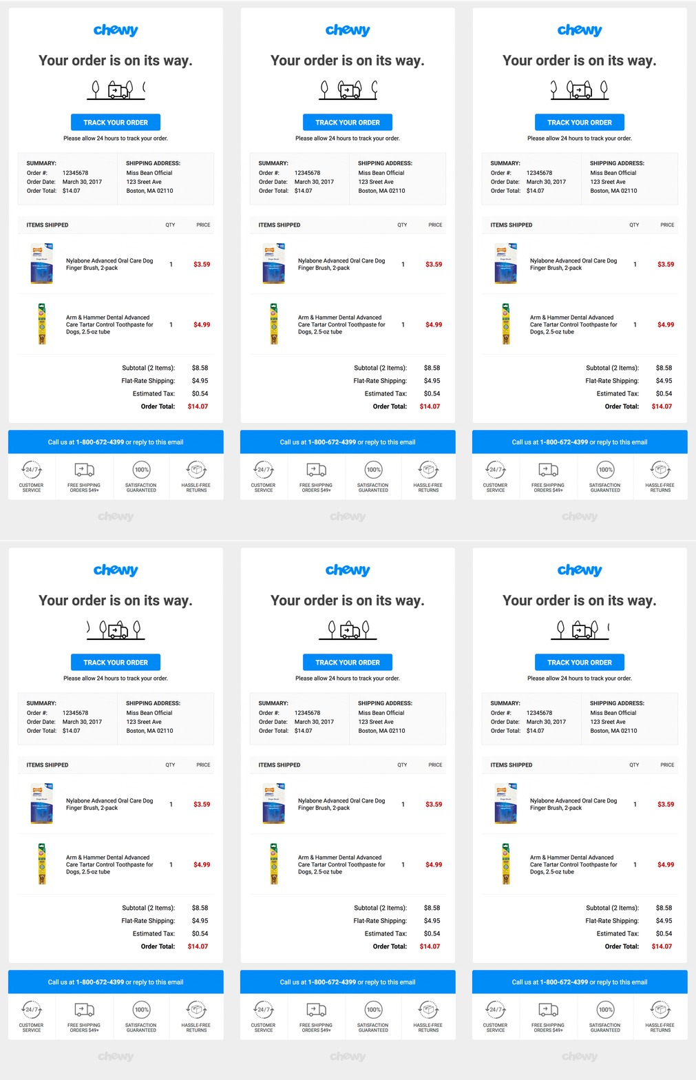
We’ve already talked about how a well designed order confirmation email can stand out in people’s inboxes and easily impress them, but this email from Chewy shows just how easy doing this can be.
By including a simple GIF of a delivery van in their email, Chewy has created an email that’s attention grabbing. Obviously the rest of the email having a nice, clean design helps, but this creates a modestly well designed email.
It just goes to show that you don’t need to hire a fancy graphic designer or photographer to send great emails.
Offers Great Customer Support
People make mistakes, even when it comes to spending money online.
And when people inevitably do make mistakes while placing an order online, they will often first realize their mistake after opening the confirmation email.
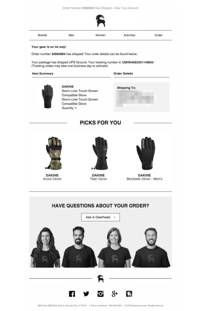
If you’ve ever been in this situation, you’ll know how desperate you can be to get in touch with the business to correct the mistake. That’s why it’s so important to make it easy for your customers to get in touch through your transactional emails like Backcountry.
At the bottom of their order confirmation email, Backcountry has a large, clear link for people to reach their customer support team.
There’s also a phone number at the very bottom of the email. However being so small, most people receiving the email probably won’t notice it.
Extra Order Confirmation Email Examples
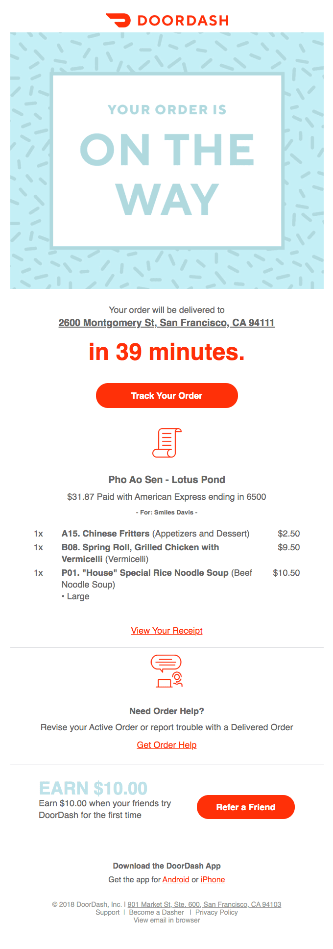
Still looking for more? We couldn’t resist sharing these purchase confirmation emails with you to give you more inspiration for your email list.


Create Your Own Order Confirmation Emails on Shopify
Now that you’ve seen examples of great order confirmation emails, it’s time to create your own. To be able to craft a well designed email, you’ll need the right tools. Using stock tools like Shopify’s email editor will severely limit your ability to stand out in people’s inboxes.
If you’re looking for the right tool to create your order confirmation emails, then we’d highly recommend you check out OrderlyEmails.
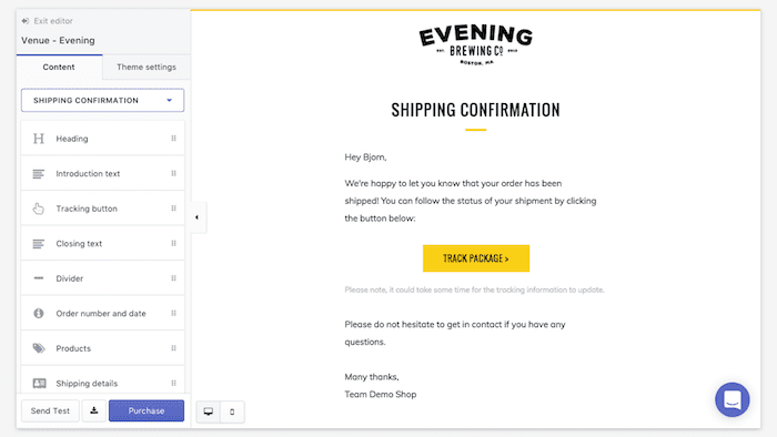
This powerful app makes it easy to design email templates and also includes features such as adding product recommendations in your emails. It will certainly give you everything you need to create a highly engaging order confirmation email.
Good luck with creating your emails!

